Case Study
Budget Buddy
How do you make budgeting less overwhelming for single parents?
MY ROLE: Competitive Analysis, User Research, Conversation Design, Wireframing, Prototyping, UI Design, Branding, Usability Testing
The Problem
Creating and keeping a budget can be overwhelming, especially for single parents who face a distinct lack of time, energy, and support.

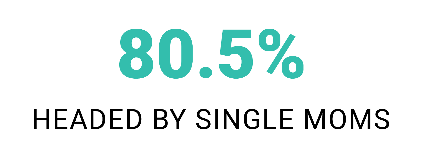

The budgeting/personal finance sector is highly-saturated with apps and programs, but these products have steep learning curves and an assumed baseline of knowledge. What was missing from that mix was a service that focused on walking users through the process, step by step.
The Goal
Create a budgeting solution that empowers single parents to begin budgeting by making it less overwhelming.
“I feel like I should be able to do it, but it seems overwhelming so I keep procrastinating and putting it off.”
"Really what keeps anybody from starting a budget, I think it’s gonna be overwhelming and I’ll fail.”
The Solution
Budget Buddy: An SMS-Based Budgeting Service
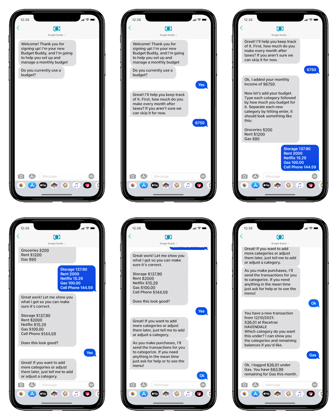
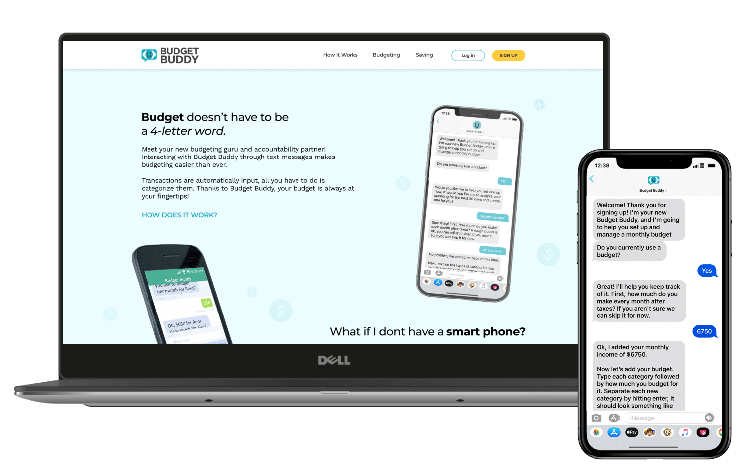
This service aims to eliminate the users’ pain points and act as a personal accountant for the user to access. Once the user has signed up through the website, Budget Buddy guides them through the process of establishing a budget, sends transactions to be categorized, encourages them to stay on track, and celebrates their progress; all through text messages.
The Process
Connecting with Potential Users
I interviewed users to understand exactly what roadblocks prevented them from budgeting. Some of them considered budgeting but didn’t know where to begin, others found themselves in way over their heads and threw in the towel.
“With something like that I have to know what I’m doing easily. I hate having to learn.”
"I have a hard time remembering to input transactions. The app can't hold onto the receipts for me, you know?"
Gaining Insight
The interviews exposed underlying themes of users being afraid they’ll fail, wanting to break the paycheck-to-paycheck cycle, needing accountability, and yearning for the security that comes with having savings.
These are heavy things to deal with, and my users are facing them alone. The topic of finances is heavily loaded and needs to be approached with delicacy.


What Do I Know?
The Solution Needs To:

Explorations
I utilized Crazy 8 sketching to come up with ideas that were outside the expected types of solutions. Websites and apps haven’t solved my user’s problems in the past, in fact, they created a problem for my users. I challenged myself to dive deeper into more unique solutions.
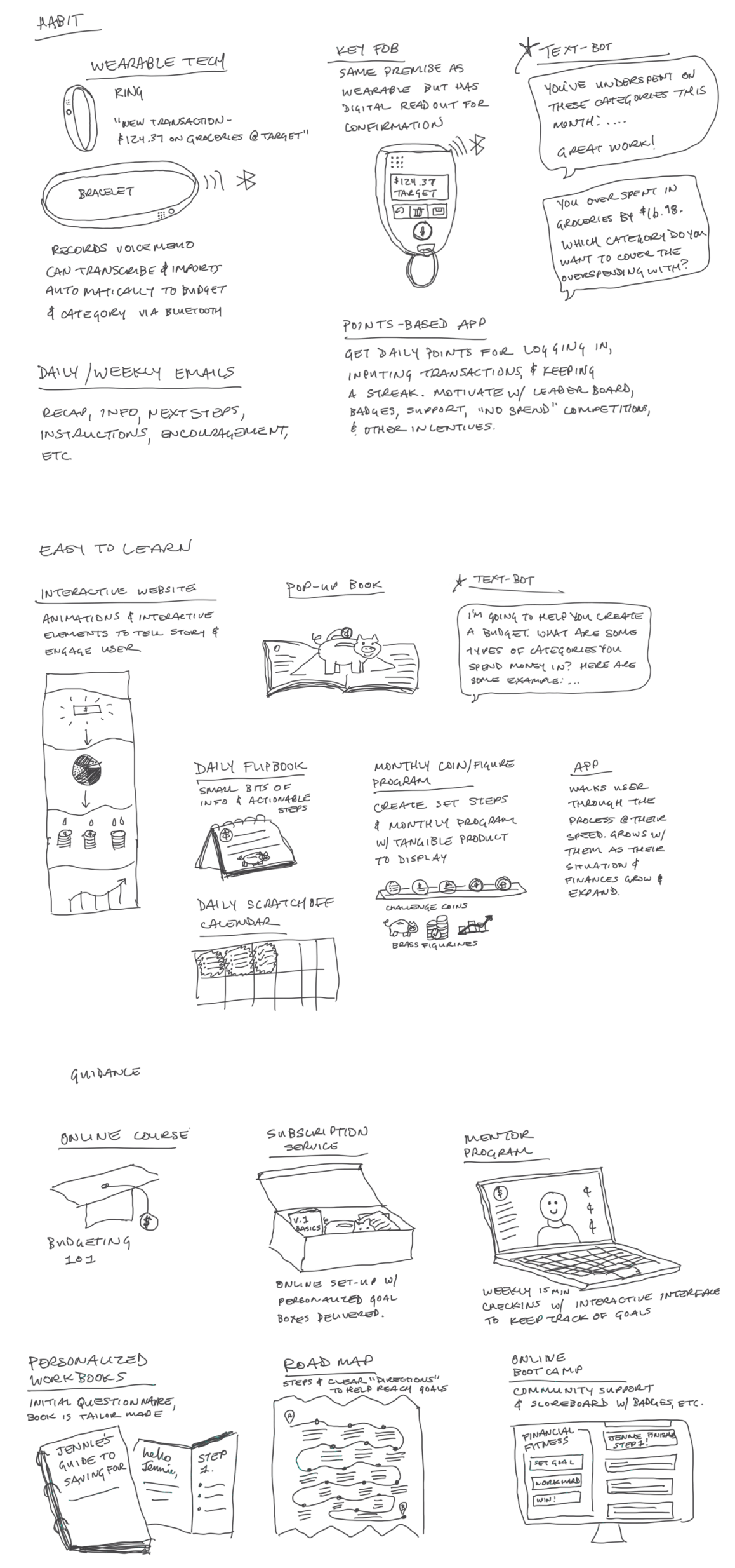
One idea checked all the boxes in a unique and exciting way; a text-bot. An SMS service that functions as a personal accountant, someone you can discuss finances with and will hold you accountable, a Budget Buddy.

Why SMS?
An SMS-based service makes sense for my target demographic. It can be accessed from any cellphone that can send and receive messages. As mentioned earlier, 31% of single-parent households live in poverty, so being able to reach single parents who don’t own a smartphone is important. An SMS service will also eliminate the complex user interface, which prevented 60% of my users from budgeting in the past.


Bringing Budget Buddy to Life
Insights in hand, I began drafting the first pass of what I envisioned Budget Buddy to be. Without the right personality, Budget Buddy wouldn’t work. Finances are a sensitive subject for most people, so the personality has to be more casual than formal, come across as an expert, and be warm and calm.

Conversation Design
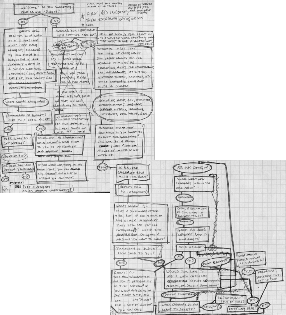
Conversational pathways began to naturally unfold as I really studied how each interaction could ease the users’ anxiety and work toward the goal of long-term budgeting. The personality began to shine through. One that instilled trust and felt like a friend, a Buddy, if you will.
Strike It From The Record
Naturally, I wanted to build the best product possible to serve my users. So much so, at times I lost sight of what the true user needs were. Having Budget Buddy analyze purchases and automatically build a budget for my users seemed like an amazing idea. Does this feature support the users' needs and goals? Long story short: No, it doesn't.
This auto-analyze feature would also present a very large issue; how could users re-categorize a transaction if the system put it in the wrong place? The conversational flow for this would be long and arduous for users. Therefore, my super cool, do-it-for-you text flows had to be scrapped from the MVP.
Trade-offs
The approach that aligns with the users' needs and goals is more simple all around; walk the user through the budget setup process and reassure them that the categories and budgeted amounts can and probably will change, eliminating their fear of “failing”. The transactions will still be pulled over by Budget Buddy, but it’s up to the users to log them in the appropriate category.
This keeps the users in a proactive role, instead of a reactive one. It also helps prevent transactions from ending up in the wrong categories. While it isn’t as sleek or advanced as a fancy algorithm, it makes more sense for the users and will ultimately be a better experience.
Flow State
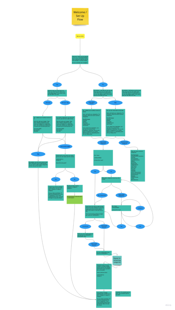
As the pathways developed, the flow diagrams grew and grew. Each action a user might want to take needed to be turned into its own component. The individual components needed to be flexible enough for the user to flow from one to the other in the same way a real-life conversation might unfold.
I read books and articles about conversation design. This research highlighted the importance of being able to “repair” the conversation, which happens dozens of times in real-life conversations. The repair could be as simple as someone saying “huh?” and could be for any number of reasons.
However, in SMS, conversation repair is seldom as quick or easy as it is in real life.
Keeping Users on the Happy Path
I spent countless hours trying to prevent the user from straying from the happy path. Guard rails and repair patterns had to be built in to prevent the dreaded, infinite error loop. “I didn’t quite catch that. Can you repeat that?” I said, "the dreaded, infinite error loop"!
Two test participants felt the guard rails were prohibitive, the others felt comfortable they weren’t going to be led down a path they couldn’t recover from.
“Feels like I’m talking to Siri, I want it to confirm less.”
“I like how this doesn’t feel like I’m talking to a robot.”
“Felt like talking to a person, more natural than a chabot.”
Some of the initial prompts caused confusion and tried to accomplish too much at once, which required too much from the user. Taking things one step at a time is the most efficient way to help users accomplish tasks and goals within this service.
Testing The Solution
Off To Be The Wizard
Wizard of Oz testing gave me an inside view of how users perceived and reacted to the “system-generated” text messages. I was able to see that some of Budget Buddy’s prompts didn’t exactly instill confidence in the users. In fact, it was the opposite. They weren’t sure if their response would be recognized and were leery of triggering an error they may not be able to recover from.
“I wonder if it might be helpful to have the example of how to type that out. Like, would it be ‘category colon’?”
“Since it is text-based and there are no buttons for me to click, would I type in ‘skip’? I guess that’s what I would do, but I wouldn’t be 100% sure.”
Reducing Cognitive Load
Multiple participants struggled to remember their categories and wanted to be reminded of them during several of the action components, such as categorizing transactions and adding categories. I considered sending a recap of budget categories and balances in these components, but in an effort to keep the messages short, a line of text was added asking if the user wanted to see their budget categories.

Human Nuance
Each test revealed more and more human nuance the system will need to recognize. A robust vocabulary of accepted responses is critical to ensure I am creating an inclusive product that can be adopted by people from all walks of life. However, this robust vocabulary only works one way. Budget Buddy’s vocabulary needs to be as simple as possible so the largest number of people can understand it.

The Results
I believe Budget Buddy is not only useful but also delightful. All of the test participants who fell within the target-demographic said they would be excited to use the service and it would help them start budgeting. Three of the test participants organically mentioned they would be willing to pay for the service. Based on the great user feedback, Budget Buddy will not only meet user needs but I believe it will also have an impressive rate of user acquisition and retention.
“It basically feels like texting, it doesn’t feel like a task.”
“This is really neat, I would totally do this!”
“I spend a lot of time texting, so this is right at my fingertips!”
Measuring Success
I believe Budget Buddy is not only useful but also delightful. All of the test participants who fell within the target-demographic said they would be excited to use the service and it would help them start budgeting. Three of the test participants organically mentioned they would be willing to pay for the service. Based on the great user feedback, Budget Buddy will not only meet user needs but I believe it will also have an impressive rate of user acquisition and retention.


Lessons Learned
Find the Right People
While connecting with test participants, I learned how important it is to talk to the right people to make sure I’m solving the right problems. I gained some great insights from people who consistently use a monthly budget, but it seemed to be reflective of their mental models of the programs they already use. The users who hadn't budgeted before still had mental models, but they weren't set in stone. The green users were more open to the concept as a whole and seemed to truly be delighted by it.
When I talked to the target demographic, the people who don’t yet budget and would actually benefit from Budget Buddy, the true gems were uncovered. Instead of focusing on the functions, they seemed to focus on how they felt while they interacted with Budget Buddy. It was exciting to see how eager they were to help shape the experience into what they wanted and needed it to be. This really highlighted the importance of talking to my true users.
Even Wizards Need help
Conducting Wizard of Oz tests on my own meant I had to split my attention between moderating and "being" Budget Buddy. While listening to my usability test recordings, I noticed a lot of… long pauses. This mostly happened when I was gathering user responses and populating the next message. Next time I would recruit a co-wizard to send the “automated” messages behind the scenes and allow the user to suspend disbelief and feel like they are truly interacting with the service. This will free me up to be more attentive to user responses rather than focusing on getting the next message populated and sent. I would have gained an even better understanding of my users had I been able to ask more probing questions based on their reactions.
