Post Up
How can I help remote workers locate high-quality public spaces where they can set up and work?
MY ROLE: User Analysis, Information Architecture, Wireframing, Prototyping, UI Design, Usability Testing
The Problem
Remote workers often have a hard time finding public spaces to work from with the amenities and qualities they’re looking for.
The Goal
Make it easy for remote workers to find a space that fits their needs, give them a true understanding of what to expect, and bring enough value to justify the monthly cost of the app.
The Solution
Post Up: Find the perfect space to work remotely
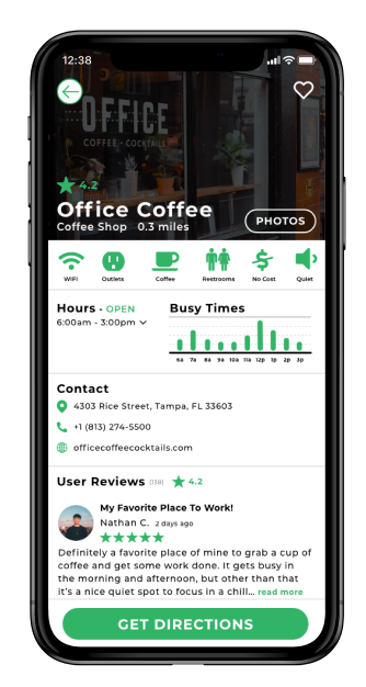
Post Up is a searchable database of remote-worker-friendly spaces, allowing users to quickly find a space that meets all their requirements. Gone are the days of spending more time searching for a space to work in than actually working in the space.
The Process
Starting at the End
For this project, I was given user research, including research highlights, a user interview, and a persona. After immersing myself in the provided research, I distilled the key insights that would shape the experience.
Remote Workers:
have difficulty finding public spaces with the specific amenities and qualities they’re looking for
have to bounce between multiple apps, sifting through dozens of reviews and photos to find the information they’re looking for
sometimes travel to areas they aren’t familiar with and have blocks of time to fill between meetings
Armed with these insights, I created end-to-end user flows to figure out what would make the most seamless and efficient experience for the users.

Inspiration
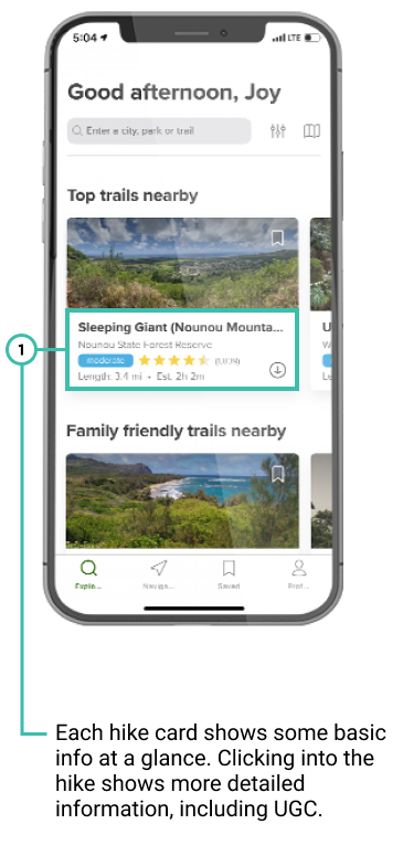
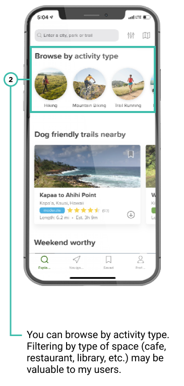
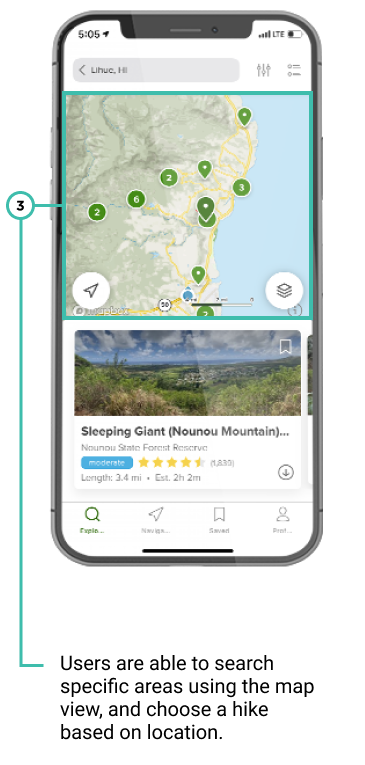
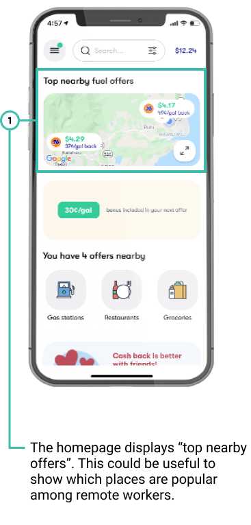
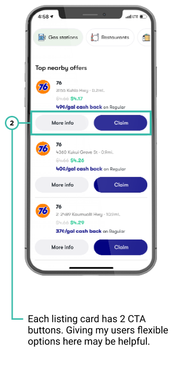
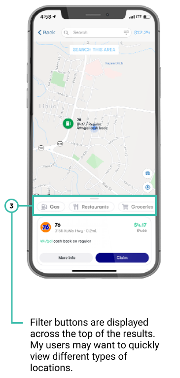
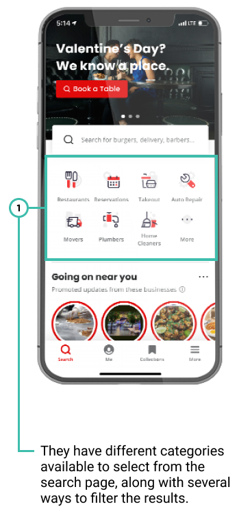
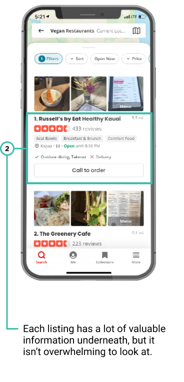
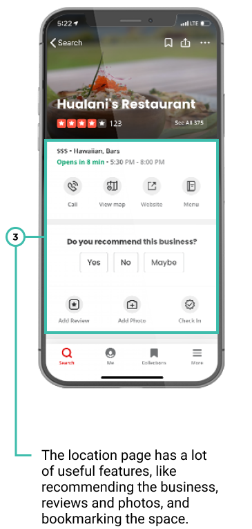
During a lightning demo, I collected screenshots to draw inspiration from. I looked at apps that helped users find something specific: AllTrails to find hiking trails, Upside (formerly Get Upside) to find deals on gas, and Yelp to find restaurants.
AllTrails
Upside
Yelp
Explorations
I focused on the results page while sketching possible solutions. Users are able to search easily, the pain point is having to filter through the results. Making the results easy to digest at a glance will save time and allow them to get back to what they need to do. Each result card will show amenity icons, an overall rating, a crowd meter, how far the location is from the user, and a button to get directions.
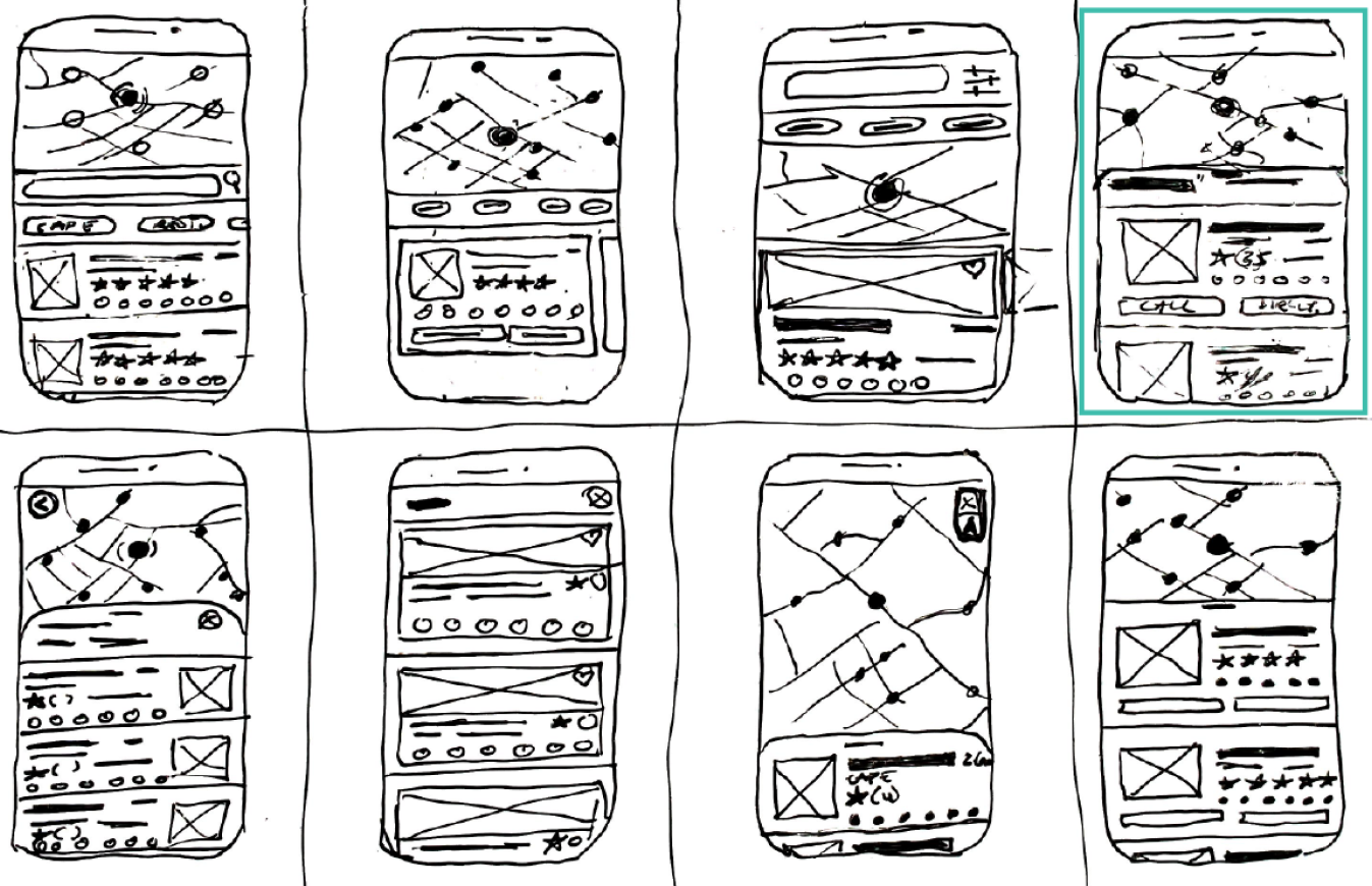
Focusing on designing the fourth option (top right corner) would best meet the users’ needs and accomplish the goal of helping them find a space.
Sketching
Insights in hand, I began drafting the first pass of what I envisioned Budget Buddy to be. Without the right personality, Budget Buddy wouldn’t work. Finances are a sensitive subject for most people, so the personality has to be more casual than formal, come across as an expert, and be warm and calm.

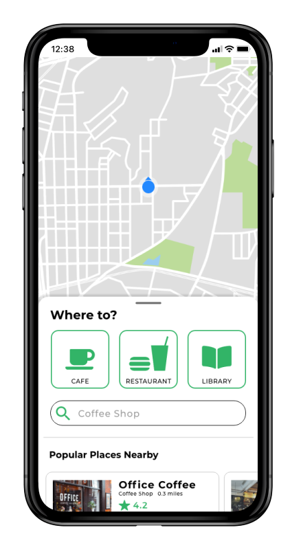
After launching the app the user is presented with a map and three location type buttons to choose from, and link to create a custom search.

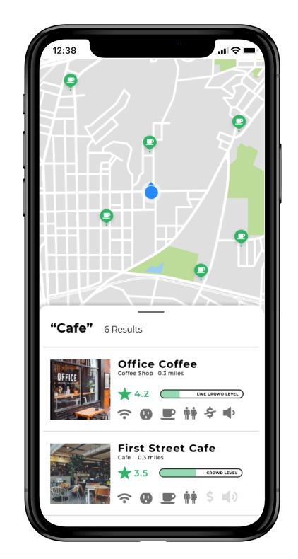
After the user clicks on a location button, the results are shown. Each location card shows basic information about the space.

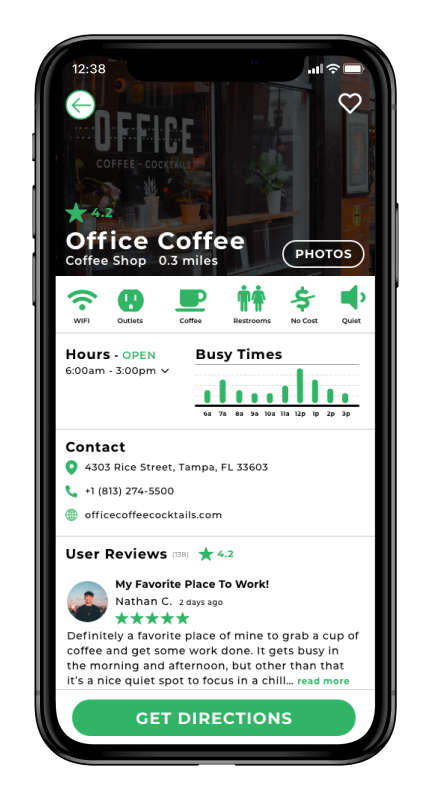
When a user clicks on a location, they are shown a hero image, some pertinent information about the space, amenity icons, hours and busy times, and relevant user reviews.
Storyboarding
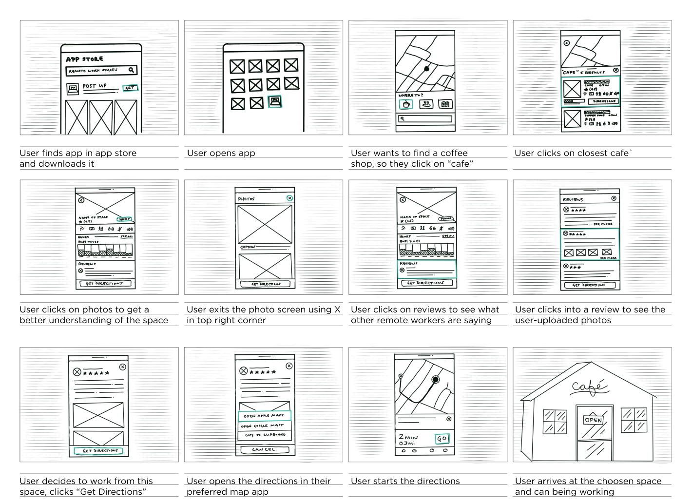
Outlining a typical use case ensured the main steps were covered and the goal was easy to accomplish. This storyboard covers the users' experience searching for the app, looking for a place, learning what to expect through reviews and photos, getting directions, and ultimately arriving at their destination.
Prototyping
I stuck with a simple, modern look that kept in line with the existing Post Up logo. To give users a better understanding of what the app will truly look like, I created content for the aspects they will interact with. The information and photos will do the heavy lifting, so I didn’t worry about adding advanced interactions or animations.
Usability Testing
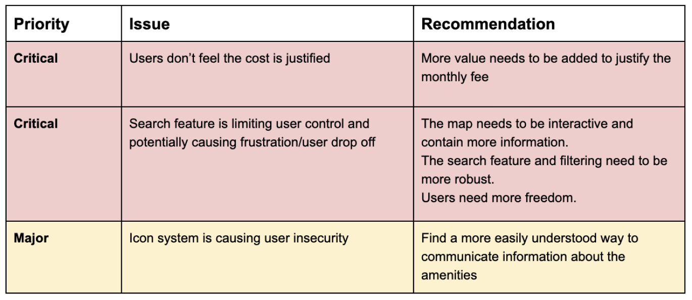
Three main issues were uncovered through usability testing.


Lessons Learned
Missing the Mark
After going through the usability tests, I realized I missed the mark to a degree. The value wasn’t quite there for users to justify paying monthly for this service. I have great insights on what types of features would add a significant amount of value for my users and these features would certainly be worked in if possible. Some feature requests were part of my initial ideas, but they ultimately ended up on the cutting room floor. In future projects, I will look more closely at the MVP feature set I move forward with to make sure it truly meets all the goals in a delightful way.
Test participants expressed concern in how the photos and reviews would be sourced. Looking back at the research, I saw a different direction I could have gone. The pain point was just having to dig through reviews and photos, so maybe the app could do the digging for them and display relevant information. This taught me to look at the research from more perspectives before moving forward with a solution.
There were also some UI issues. The icon system I used to convey amenities initially caused some uncertainty. Users interpreted four of the icons correctly, but the bathroom icon and cost/no cost icons were misinterpreted or questioned three times. There is likely a better way to convey this information, so I would need to explore more options.
