Stock Alarm
How can we help investors scan the market to uncover investment opportunities?
TEAM:
Shiva Malavika Ganesh, Jason Sutherland
MY RESPONSIBILITES:
Competitive Analysis, Information Architecture, Wireframing, Prototyping, Usability Testing
The Client
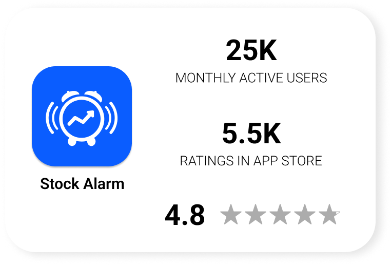
Stock Alarm is a mobile and web application that allows day/swing traders from all backgrounds to set conditional alarms to be triggered by live stock price movement.
The Problem
Existing stock market scanners are expensive, overly-complex, and inaccessible for amateur traders, leaving them without a viable or sustainable way to discover new trading opportunities.
The Goal
Create an affordable, easy-to-use tool that empowers amateur traders to track multiple assets and search the market for hidden investment opportunities using customizable filters, with the intention of increasing user acquisition and retention.
The Solution
Stock Alarm Stock Scanner:
Scan the market on your terms
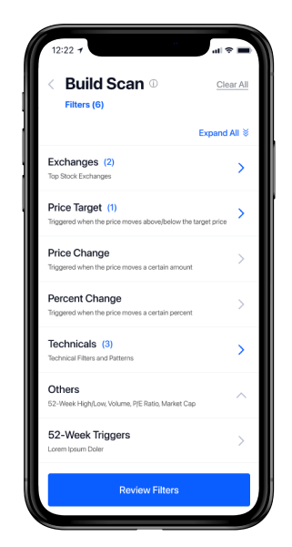
Users build a scan by inputing custom filters and in turn they are shown a list of stocks that currently meet their criteria. From there, users can set alerts for the newly discovered stocks, keeping them up to date on investment opportunities and buy/sell events.
The Process
The Brief
We were provided a brief with a feature outline, market opportunities, and current competitors. We were then tasked with building a minimum-viable version of a stock scanner that could easily be integrated with the existing Stock Alarm features.
The client received multiple feature requests from current users. They were all worded differently, but underneath it all the users are looking to accomplish the same goal: uncover new investment opportunities.
Users want a way to:
track more than a single asset
see all stocks that cross a specific threshold at any given time
scan the market/screen stocks to find new opportunities
Bridging the Gap
The CTO saw the stock scanner as a great opportunity to increase user acquisition and retention. His vision was a scanner that works for both extremes of the investor spectrum. It needs to be simple enough for complete amateurs to use and understand while also being robust enough for seasoned professionals to find value in it.
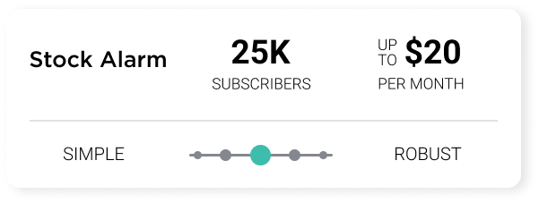
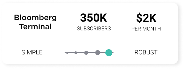
The current industry standard platform, Bloomberg Terminal, is inaccessible to most amateur traders due to the high cost. This leaves a very large gap in the tools available to amateur and former-professional traders. Stock Alarm is aiming to bridge the gap and create a viable, affordable, user-friendly alternative. They want to go a step further by adding an educational element to it as well, bridging an even wider gap between amateur and professional traders.
Managing Constraints
During our kick-off call, Stock Alarm proposed the scope of the project, including what screens they thought would be necessary for the MVP. This scope would evolve as we dug deeper and began to understand what this experience needed to be. The stakeholders wanted to research, design, develop, launch the feature as quickly as possible, in 5-weeks time to be exact.


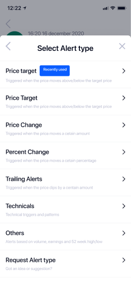
existing alert trigger menu
A Solid Starting Point
The Stock Alarm team had a pretty clear idea of what they wanted this feature to be. The new scanner, housed in the tab bar, would augment their existing alert trigger options. Some filters would not be applicable, so the list had to be pared down.
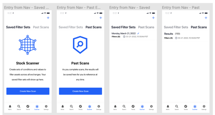
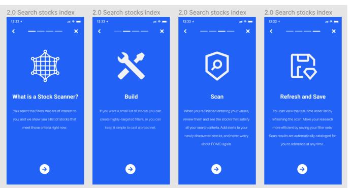
The options need to be customizable so users can build scans according to the filters that are important to them. They knew approximately where they wanted the entry points to be, and anticipated they would need a NUX (New User) flow to educate first-time users about how the feature works. They were open to our suggestions, of course, but they already had a pretty solid model in their minds, and consistent branding to carry across the new screens.
Grappling with Complexity
As my team brainstormed and sketched initial concepts, we quickly realized how complex the menu was going to be, and how many different use cases we needed to be able to accommodate. You could have a thousand different users and each one would likely use this feature in a different way. How can we design a system that works well for all of them?
It needs to make as much sense for the amateur trader just getting into stocks, filtering by price and percent changes, as it does for the pro trader who understands how the more technical filters will interact and influence the results on a deeper level.

a small portion of the tree table menu
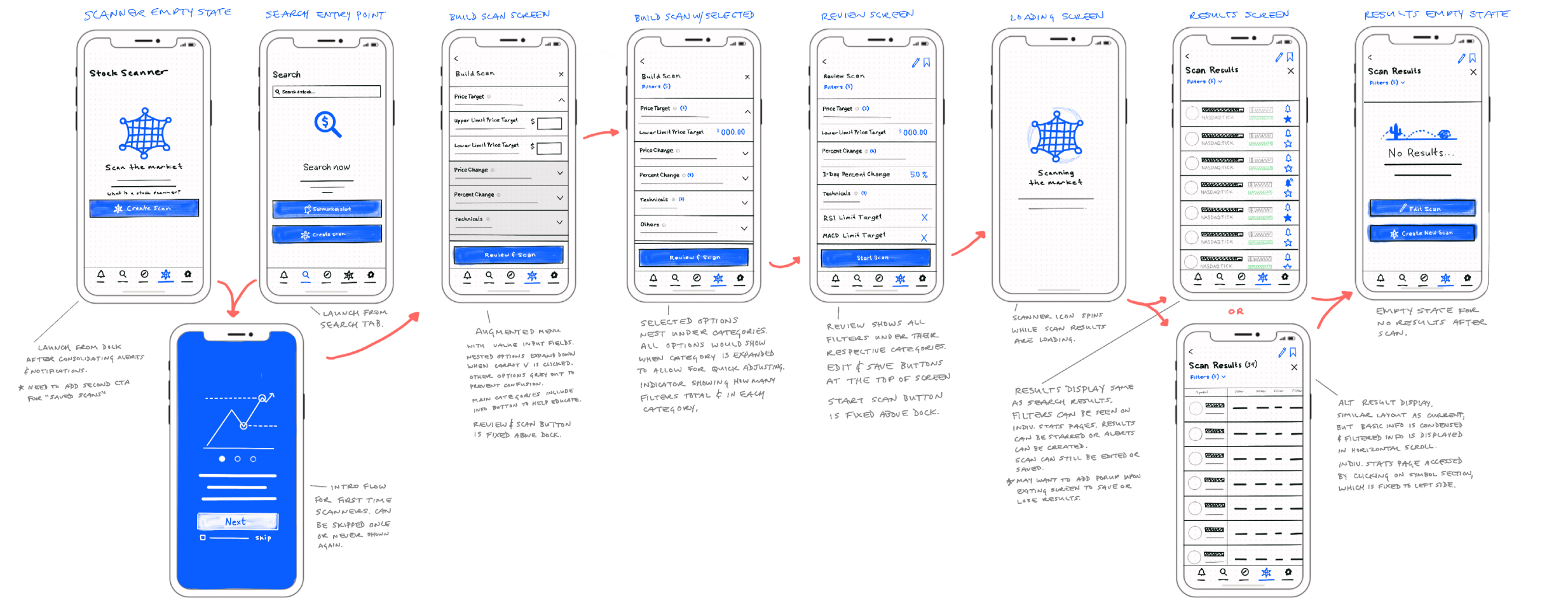
Sketching
We explored how users could build the scan criteria, what the review process would look like, how they could edit their parameters, and what it looks like when they review their filters and initiate the scan. Each screen opened the door to more questions. If users are putting a lot of time and thought into these scans, they will likely want to use them again without having to start from scratch, so how would that process work? How can they save and edit their filter sets? What will they want to do with the results? What if the scan returns tens of thousands of results? What if it doesn’t return any? There was much to consider.
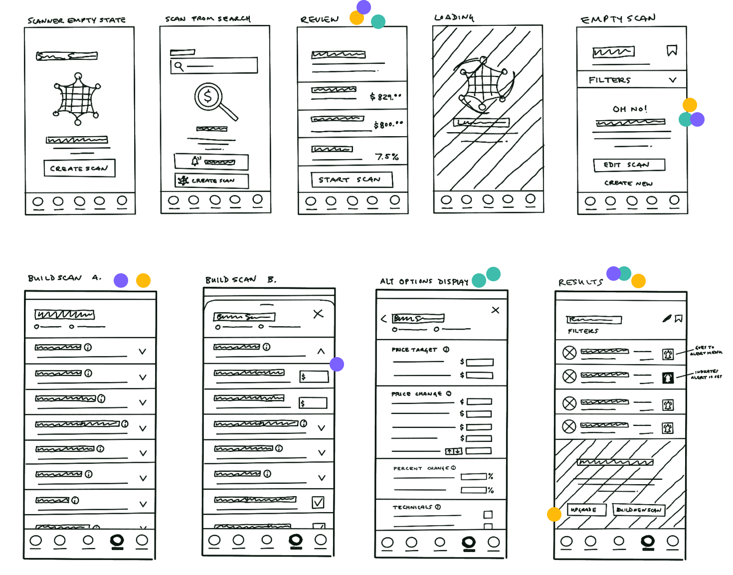
Working against the tight deadline, we quickly voted on the screens and features we thought would best serve the users.
Wireframing
We cleaned up the chosen sketches and presented them to the client. These wireframes seemed to check all the boxes; they were well-branded, clean and simple, would help users parse through the filters and results easily (we hoped), and wouldn’t be difficult to develop.
Taking Ownership
From here, we each took ownership of three main screens and their respective sets of components.


Something's Not Right
All this time, I couldn’t shake the feeling that we overlooked something. Something wasn’t quite right. We had a laser focus on this new scanner feature and how it would interact with the existing features. I stepped back to look at the big picture and realized searching and scanning are not vastly different from one another. They certainly aren’t so different they warrant separate tabs on the navbar.
A Better Solution?
A better solution for this might be to combine the search and scan features. Long-term, having them combined will likely be a more usable experience, one users will find more valuable. It would also create organic opportunities for users to learn about and interact with the scanner if it’s combined with a feature they are already familiar with and know how to use.
Proposing Redirection
I presented this idea to the team; restructuring the information architecture of the entire app to make it a more streamlined experience. I was truly excited about this, it could be a game changer for Stock Alarm. It would mean starting back at square one as far as this project is concerned, but it had the potential to elevate the user experience for Stock Alarm higher than they could’ve imagined.

Unfortunately, my team did not share my excitement. It was decided we would stick with the original scope and build the separate scanner as requested due to the tight time constraints. I was disappointed, but the show must go on. In order to meet the deadline, we proceeded with the sketches we presented to Stock Alarm.
Pushing Forward
We made changes based on their feedback, and presented the first version of our prototype. Once we received comments on the prototype, it was time to reiterate again and keep improving the experience.

An Intricate Prototype
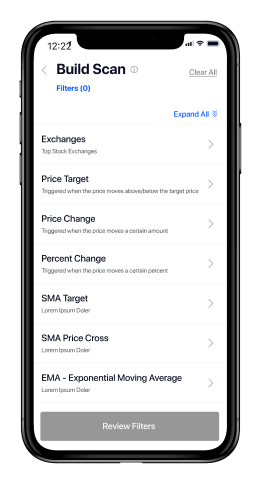
Even feeling our solution had some immediate limitations and issues, I set out to make my interactive prototype. The Build Scan screen presented some large challenges. I was dealing with a tree table menu that had 3-4 layers of nested submenus. The accordion interactions needed to feel as realistic as possible, so I created a large set of components. This would allow users to truly get a sense of what it would feel like to interact with this potentially problematic portion of the experience.
However, the prototype was not without its issues when it came to the auto-layout of nested components. Some accordions behaved flawlessly, while others became overlaid, obscuring the text beneath.
Gotta Lotta Issues
Our usability tests highlighted numerous issues. The most critical issue validated my gut feeling about the information architecture needing to be reformed. Four out of five users immediately navigated to the search screen when asked to find a way to discover new stocks based on custom criteria. Additionally, the fifth user mentioned he would likely go to the search page, but knew we were testing the scanner and navigated there instead.


We ran into more issues than any of us anticipated, but the sessions were still a huge success. We gained a lot of great insights into how people expect the app to behave, how they think the information should be organized, and what they would do with the scan results.
Deliverables
Our final deliverables were the V2 prototype, usability test artifacts (recordings, notes, and report), and recommendations for remedying the usability issues and improving the overall experience.
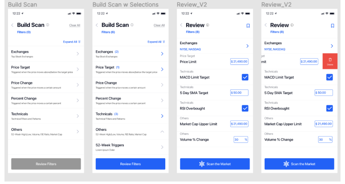
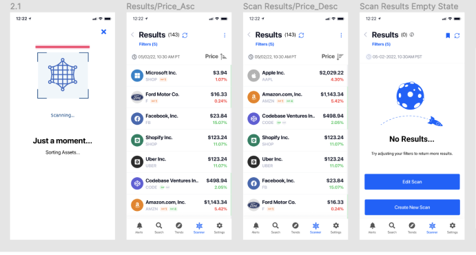
Concepts and designs by me, Shiva Malavika Ganesh, and Jason Sutherland.
Lessons Learned
Concept of Deliverables
While I was happy with the final deliverables we provided to the Stock Alarm team, I realized that throughout this project I had focused too much on a clean, branded UI being the final deliverable. The branding was already established and is implemented well, so my focus should have been on gathering more insight into how users wanted to interact with the scanner and results. Had we shifted our focus towards the content and components, sticking with polished wireframes or low-fi prototypes, we could have tested sooner and potentially had time for one more iteration before the hand-off.

Thinking Big
If I could go back, I would think bigger in the very beginning stages of this project. If I had looked past what the stakeholders were asking for to get to the true “why” and “how” of the feature, I could have advocated for I.A. restructure from the start. I may have had a better chance of getting team and stakeholder buy-in.
From my six years of experience as a digital and print designer, I know the importance of putting my ego and opinions to the side when necessary. This was certainly one of those times. Being staunchly opposed to adding the scanner as a stand-alone feature would do no one any good in this scenario. Instead, I compromised and delivered the best version of our solution I possibly could. It would be a disservice to everyone involved to do anything other than that. Having strong opinions has its place, but knowing when to compromise does, too.

North Star
Another lesson was to look further ahead when imagining what a product can be. I wish I would have asked the stakeholders what their vision was for the feature in 1 year, 3 years, even 5 years. I could have rallied to let that guide the MVP instead of development steering the ship.
