Case Study
Stock Alarm
Helping investors scan the market to uncover investment opportunities.
Role
Focus
Tools
Team
Shiva Malavika Ganesh, UX Designer
Jason Sutherland, UX Designer
Stock Alarm
The Brief
Stock Alarm is a mobile and web application that lets traders of all experience levels set conditional alerts triggered by live stock price movement. The product had traction with a core user base, but a consistent pattern of feature requests had emerged: users wanted a way to proactively discover new stocks, not just monitor ones they already knew about.
The CTO's vision was precise: a stock scanner that works simultaneously for a first-time investor filtering by price movement and a seasoned trader running multi-variable technical screens. The same product. The same interface. Usable by both.
We had five weeks.
The CTO's vision was precise:
a stock scanner that works simultaneously for a first-time investor and a seasoned trader
The Market Gap
Professional-grade stock scanning tools exist. Bloomberg Terminal is the industry standard and costs approximately $24,000 per user annually. That price point is not an inconvenience for institutional traders; it is a complete barrier for the amateur and semi-professional investors who make up the majority of the market.
Stock Alarm's strategic position was clear: build the tool that Bloomberg's price makes impossible for most people to access. Make it accurate enough for professionals and simple enough for amateurs and people just learning to invest.
The design challenge was usability and democratization. Designing a system complex enough to be genuinely useful while accessible enough that complexity never became the barrier.
Stock Alarm
25k+
$20
Bloomberg Terminal
350k+
$2,000
The Complexity Problem
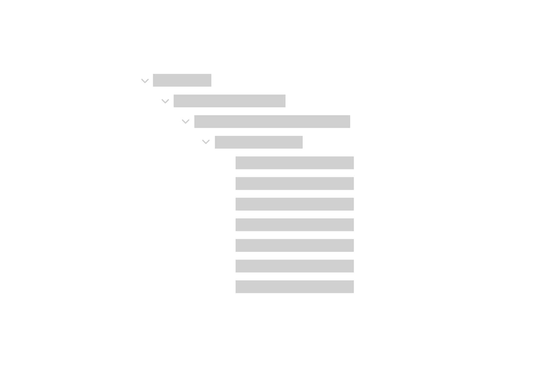
The scanner's core interaction was deceptively hard to design. The filter library had 3-4 layers of nested categories. An amateur trader might use two filters, a professional might combine twelve. The interface had to accommodate both without making either feel like they were using the wrong tool.
The tree table we mapped before wireframing made the scale of the problem visible: dozens of filter categories, each with multiple options, each combination producing different results. A thousand users would likely produce a thousand different scanning patterns. The design system had to be flexible enough to support all of them without becoming incoherent.
Managing scope under pressure
At the kick-off call, the client outlined their anticipated scope: a set of screens they believed would constitute the MVP. That scope was a starting point. It evolved significantly as we understood what the experience actually needed to be.
The five-week timeline was real and immovable. Development was ready to build as soon as designs were approved. Every decision about what to design, prototype, and test was made in the context of a deadline that couldn't move.
That kind of constraint is its own design problem. The question isn't just what's the best solution, it's what's the best solution we can fully validate and hand off in the time we have?

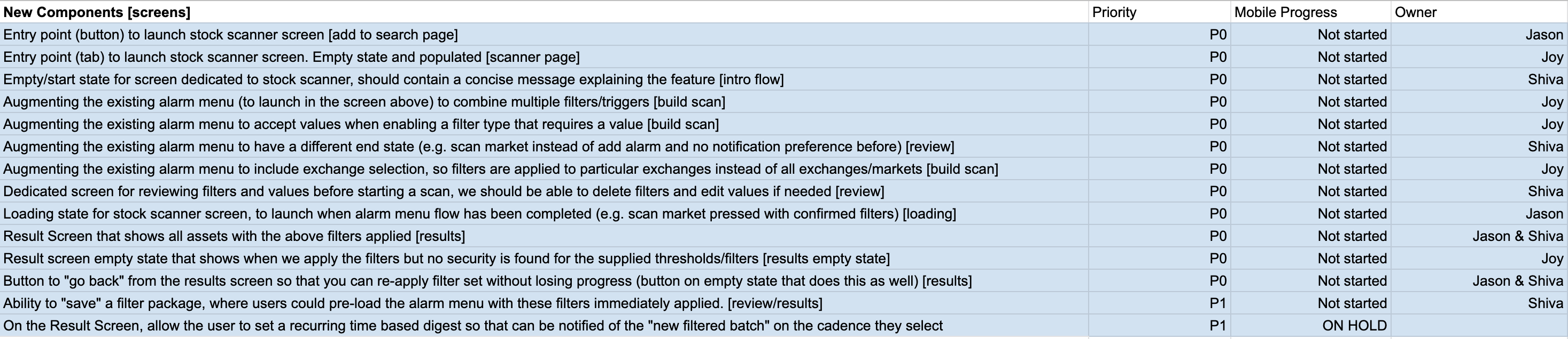
Sketching and wireframing
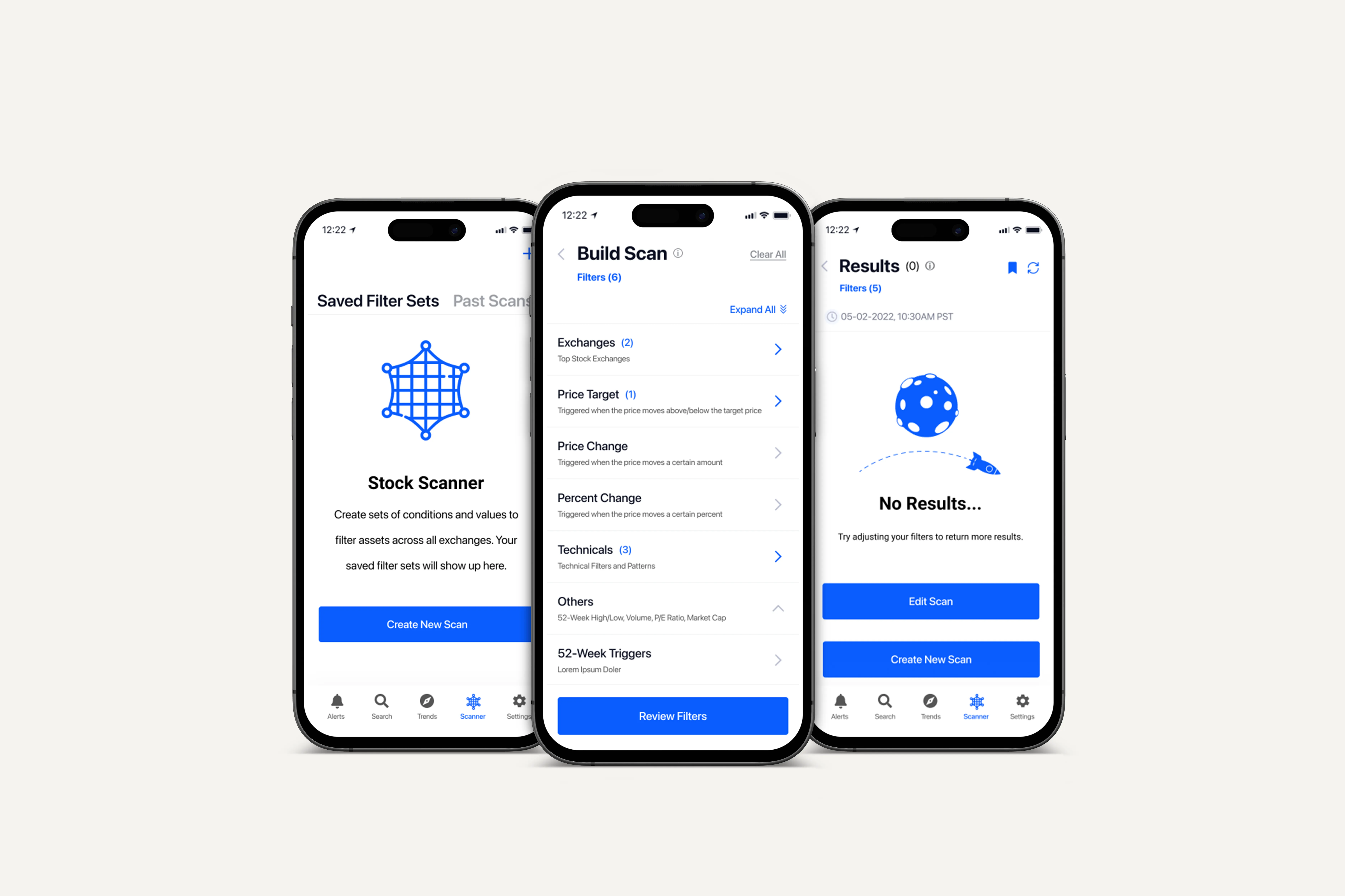
We worked through how users would build scan criteria, review their parameters, initiate a scan, and handle results — including edge cases like scans returning tens of thousands of results, or none at all.
Every screen opened new questions. If users were investing significant time in building complex scans, they'd want to save and reuse them. What does that management flow look like? What actions make sense after results are returned?
We voted quickly on directions, presented wireframes to the client, and divided ownership of the primary screens for high-fidelity development.
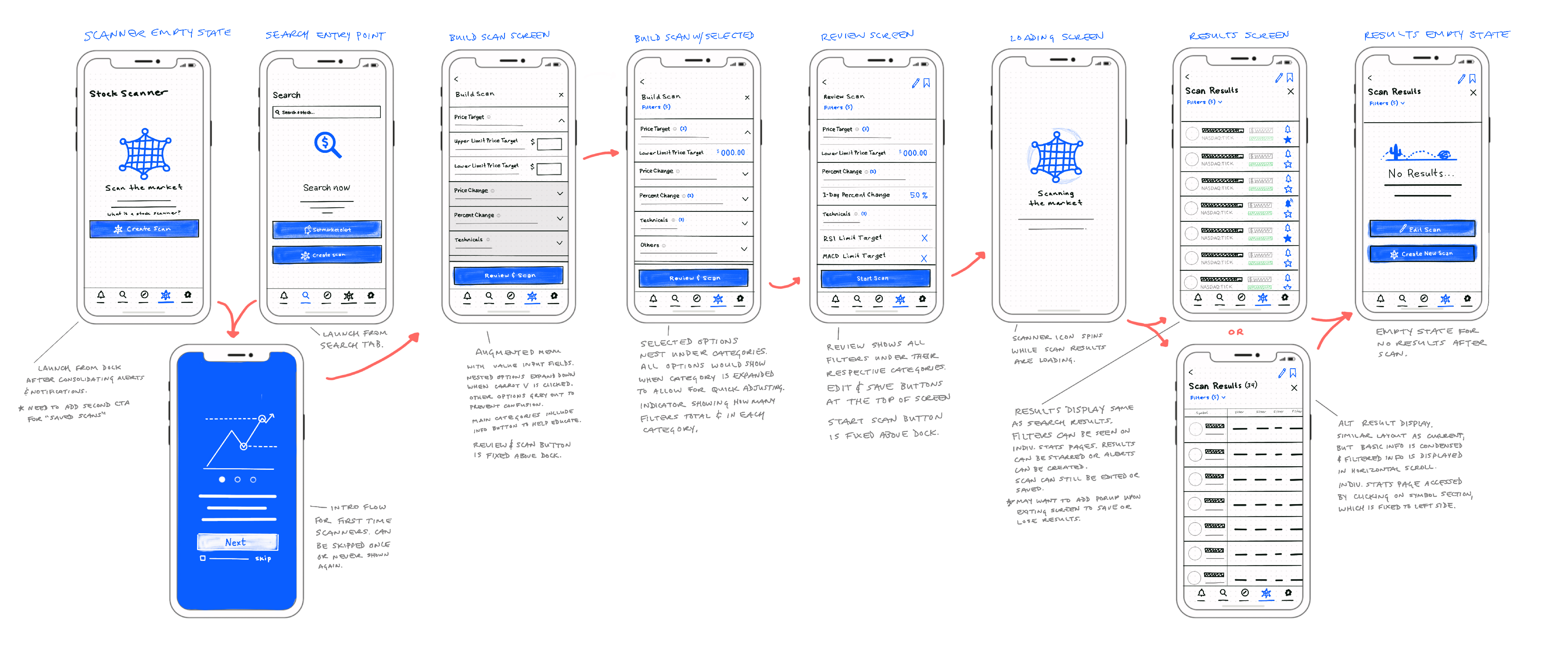
The structural question
Midway through high-fidelity design, something wasn't adding up.
I pulled back from the individual screens and looked at the full information architecture. The scanner was being designed as a standalone tab in the navigation — a separate destination users would go to when they wanted to scan. But the existing app already had a search feature, and search and scan are not, in practice, meaningfully different behaviors. Both are ways of finding stocks you don't currently know about. Both use criteria to surface results. The primary difference is that scanning is search with saved, customizable filters.
The implication was significant:
we were building a new tab for a behavior that users would naturally look for somewhere else.
I brought the idea to the team: restructure the information architecture to combine search and scan into a unified discovery experience. Keep the scanner's full filter capability, but integrate it into the existing search paradigm users already understood. Long-term, it would be a more usable product. It would also create natural discovery of the scanner feature for users who were already comfortable with search.
The team heard it and considered it. Given the five-week deadline and the development team already aligned to the existing scope, we made the pragmatic call to proceed with the original architecture.
That decision was the right one for the engagement, but not the right one for the product.
Building the prototype
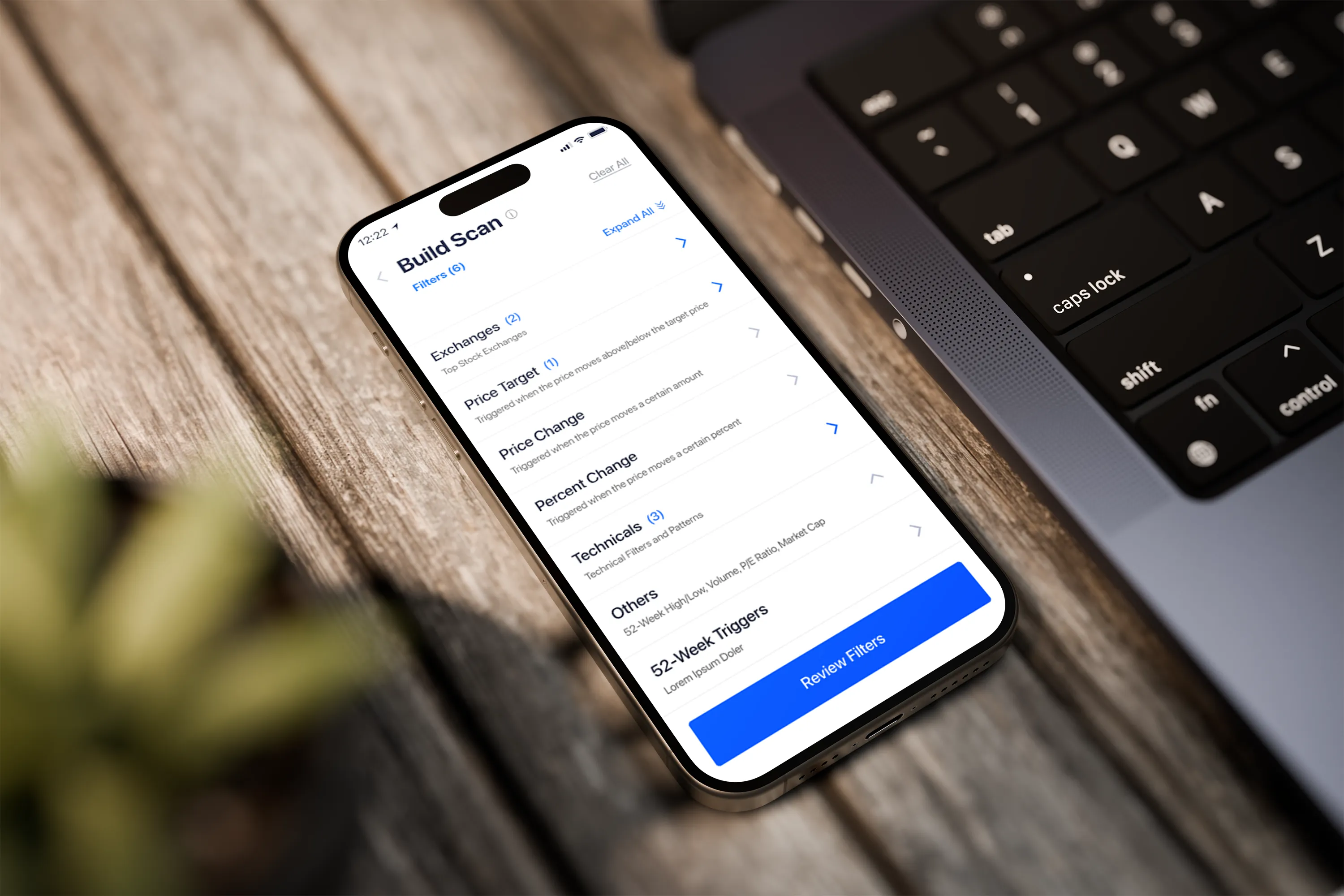
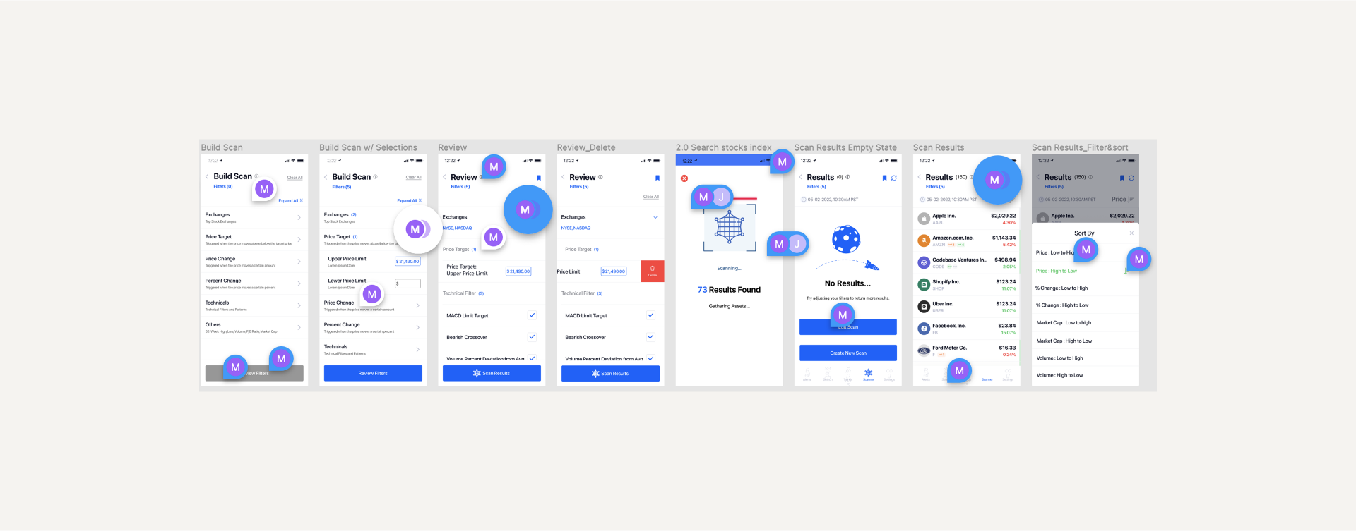
Even knowing the IA had structural limitations, the prototype needed to be as faithful to the real experience as possible, especially for the Build Scan screen, where users would interact with the nested filter menu.
I built a component system for the accordion interactions; multiple layers of nested submenus that needed to feel realistic enough to generate valid usability data. This was technically demanding Figma work: the auto-layout behavior of deeply nested components creates compounding complexity, and some accordions performed flawlessly while others had rendering issues that obscured content beneath them.
The prototype was not perfect, but it was rigorous enough to surface what we needed to know.
Usability testing
Five participants. Moderated sessions. The primary test question: given the app, find a way to discover new stocks based on custom criteria.
The results were unambiguous.
The testing also surfaced five additional usability issues in the scanner experience itself.
That's 5 of 5 users telling us the same thing:
the scanner doesn't belong where we put it.
What testing proved
When 4 of 5 users independently navigate to the same wrong location looking for a feature, that's not a discoverability problem, it's an architecture problem. The usability testing didn't uncover a flaw in our design. It validated a structural observation I'd made before the test sessions ran.
That means the issue isn't fixable with better labels or a more prominent entry point. It's fixable with a restructured IA that puts search and scan in the same place; where users already expect to find both.
The recommendations report made this case explicitly. What Stock Alarm does with it is their decision. Our job was to make sure the evidence was undeniable.
What we delivered