Case Study
NAF Pride
Foster a workplace culture where LGBTQ+ employees can bring their full selves to work.
Role
Focus
Tools
Team
Shauday Smith, Design Director
Kevin Thomson, Creative Director
Too long; didn't read
The Client
NAF Pride is an LGBTQ+ initiative of New American Funding (NAF). It was built to make home ownership more accessible, inclusive, and affirming for queer individuals and families, while fostering a workplace culture where LGBTQ+ employees can bring their full selves to work.
In an industry not historically known for inclusion or cultural fluency, NAF Pride represented a meaningful internal commitment: not a campaign for Pride month, but an ongoing program with dedicated resources, community partnerships, and a design identity built to last beyond June.

The Brief
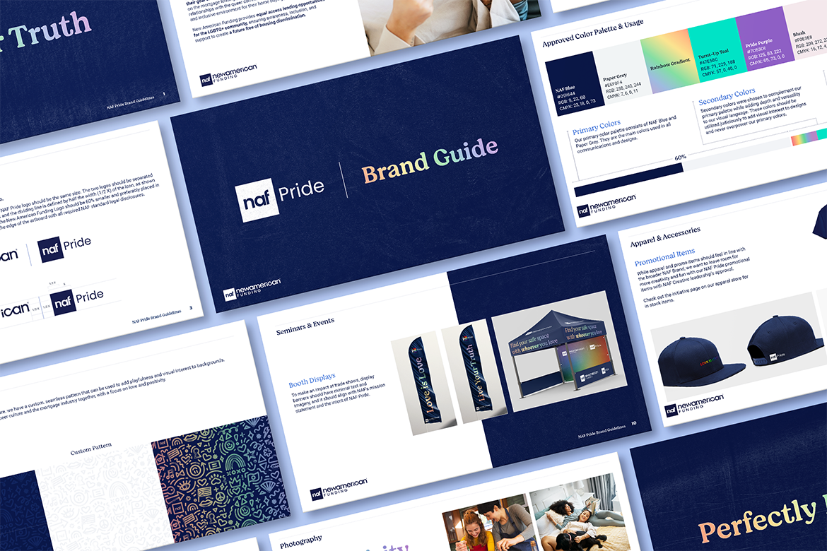
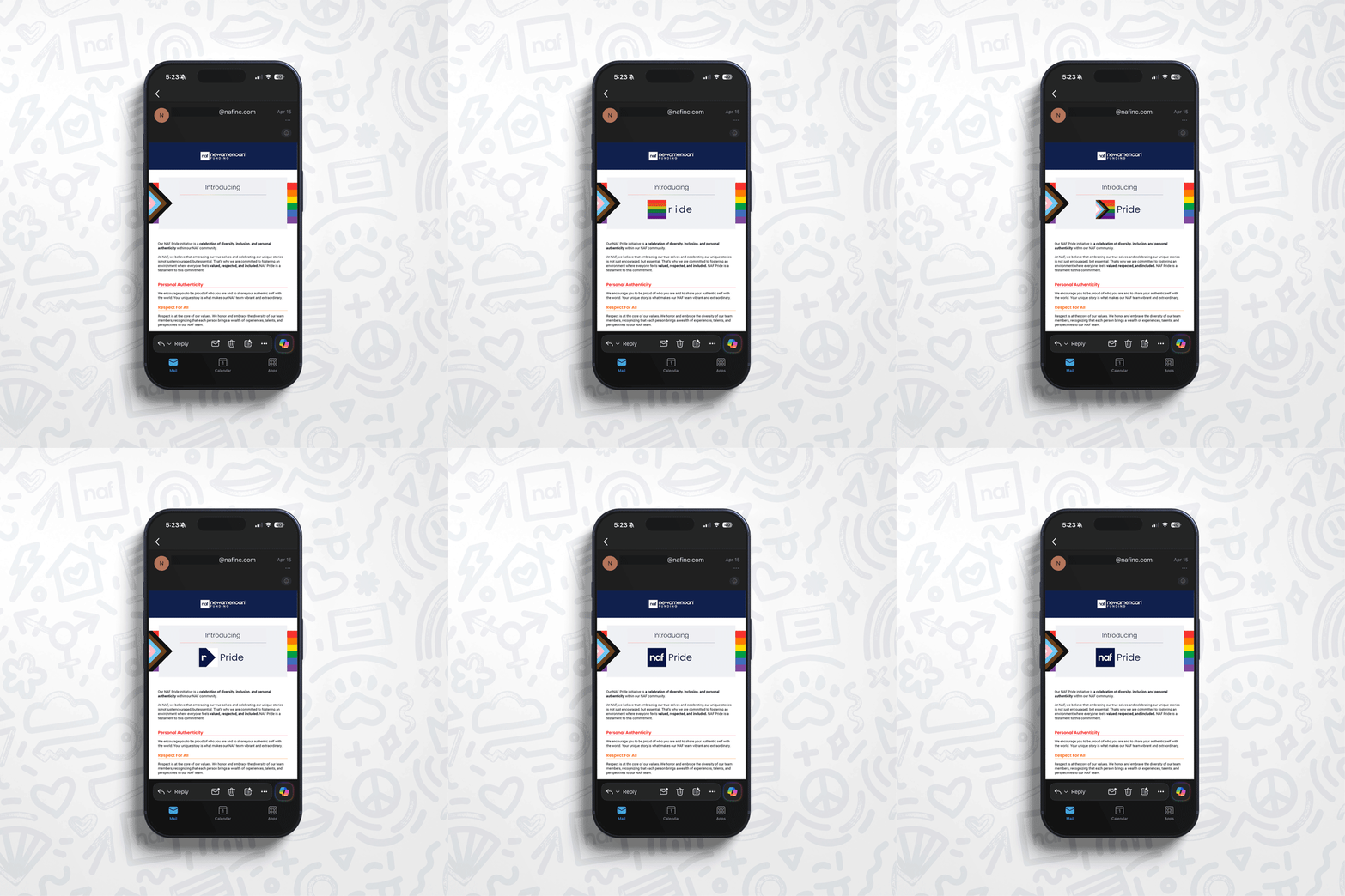
I was brought in to build NAF Pride's visual identity from the ground up — a complete brand system that could function across internal and external touchpoints: social media, email, print, events, physical merchandise, and a brand guide that other designers and teams could use consistently going forward.
The brief had a constraint most brand projects don't: the identity had to sit within NAF's existing master brand without erasing it, while still feeling meaningfully distinct. In other words, not just NAF with a rainbow applied to it.
The real brief, underneath the stated one, was this: design something that members of the LGBTQ+ community would recognize as made for them, not at them.
Designing a Pride identity for a mortgage company is a genuinely complex brief. The risk of performative allyship is real and reputation-damaging. The risk of being so restrained that the initiative reads as hollow is equally real.
The Challenge
This is a brief that can fail in two obvious directions.
First, rainbow-washing: loud rainbow gradients and Pride flag colors applied wholesale, the full visual vocabulary of corporate allyship that the LGBTQ+ community has learned to read as performative.
Second, fearful avoidance: a design so cautious about stereotypes it ends up saying nothing.
The Approach
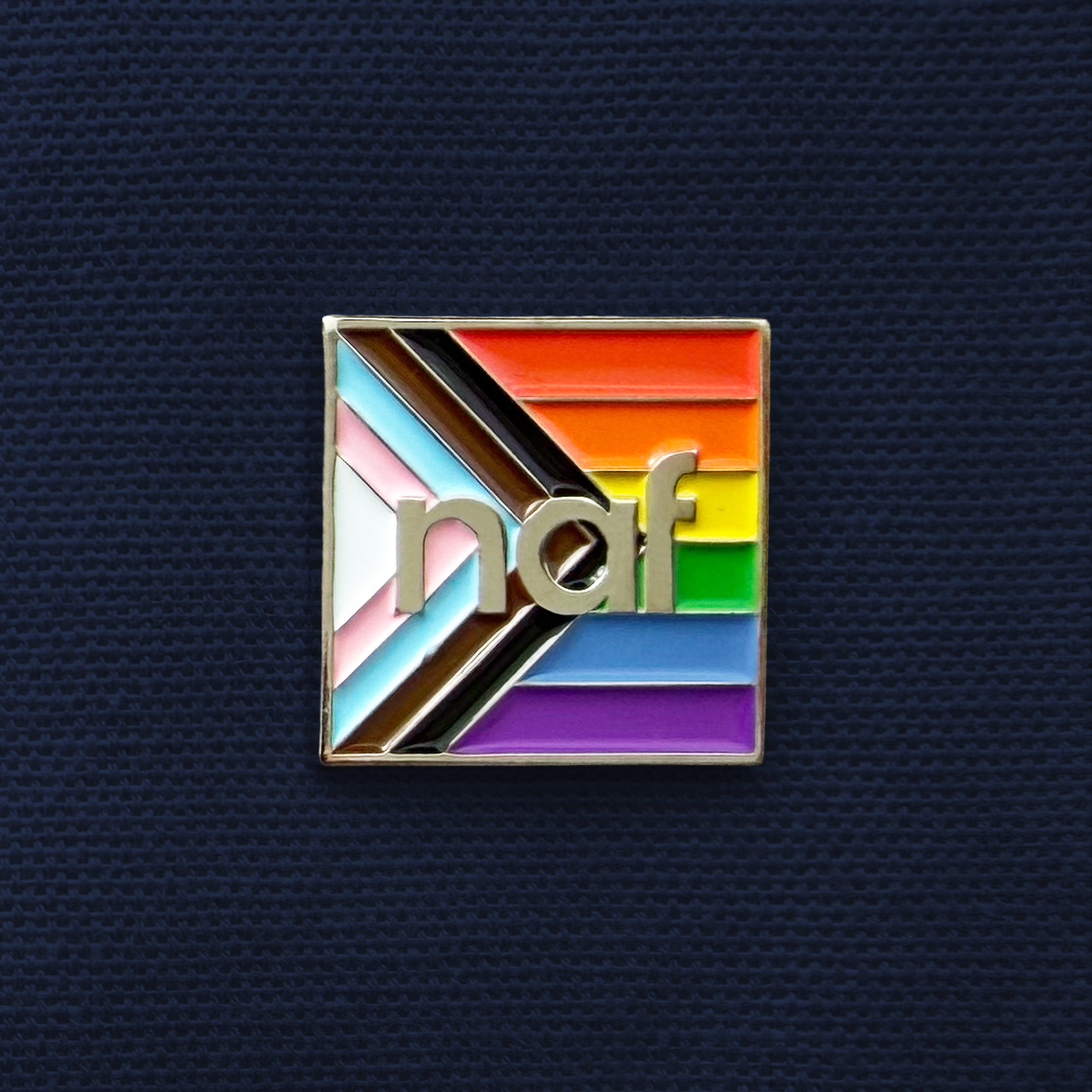
The design approach was rooted in honoring the history and resilience of the LGBTQ+ community while keeping the visual language refined and approachable. It draws subtle inspiration from the grassroots energy of early queer movements — handmade signage, community organizing, DIY aesthetics — but translates those cues into a more polished, contemporary system.
Rather than relying on overt or stereotypical visual markers, the design leans into nuance: restrained color applications, thoughtful typography, and understated references that quietly acknowledge the movement's origins. The goal was to create something culturally relevant and authentic without feeling performative; an identity that respects the past while fitting seamlessly within a modern financial brand.
The result is a visual system with real cultural intelligence built into its bones.
Pride as conviction, not as a costume.
The Work
My Role
Design Lead and Planning Committee Board Member
The board membership is the part of this project that doesn't appear in the deliverables list but shaped everything in it. Being in the room for the strategic decisions meant that by the time I opened a design file, I understood the brief at a level that wouldn't have been possible if I'd been handed a spec sheet.
How It Landed
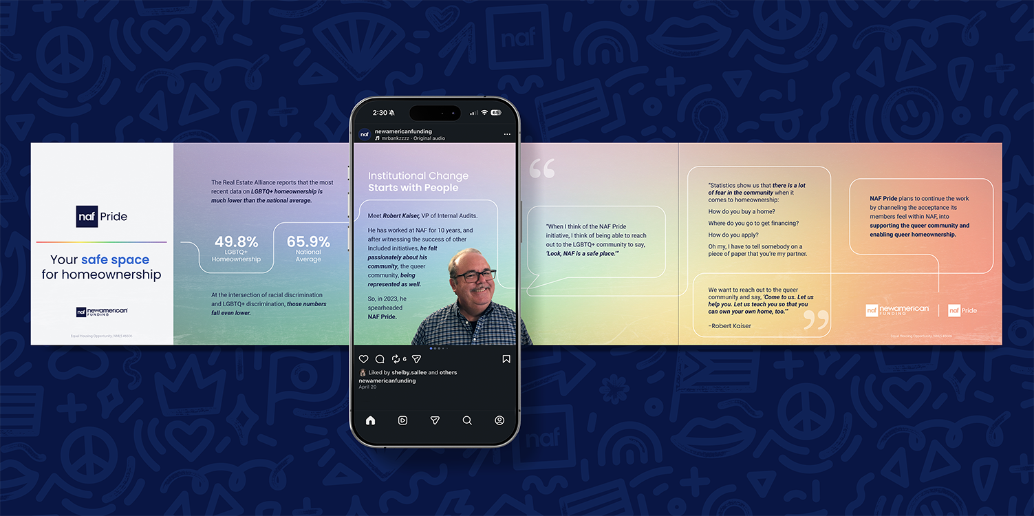
NAF Pride launched across NAF's full internal ecosystem, reaching employees across hundreds of branches nationwide.
Within the first 6 months of launching, 155+ members signed up for the NAF Pride intranet space and 120+ employees participated in the NAF Pride Ally Certification Course.
The initiative has continued past its initial launch, with the design system evolving alongside it. NAF began offering the certification course to external Loan Officers, Real Estate Agents, and other industry professionals, helping to create a shift in how the industry serves the LGBTQ+ community.
What Made It Worth Doing
There's a version of this project that would have been easier to make and faster to forget. A rainbow wordmark, a June campaign, and assets that checked the box but communicated nothing.
The version we made asked harder questions: what does authentic allyship actually look like in visual language? How do you honor a movement's history without co-opting it? How do you design something for a community that has every reason to be skeptical of corporate good intentions?
Those questions don't have clean answers, they have considered ones. The work reflects the consideration.
A mortgage lender that helps a queer family buy their first home is participating in one of the most consequential moments of that family's life. The design that surrounds that experience should be worthy of it.