Abstract soft gradient background blending coral, teal, and off-white colors with a grainy texture.
Case Study

Budget Buddy

An SMS-based budgeting service.

Role

Research, Strategy, Conversation Design, Branding, Web Design, UX, Usability Testing

Focus

Create a budgeting solution for single parents

Tools

Adobe CS, Figma, Miro

Too long; didn't read

SUS Score
95.625
CSAT
100%
WTP (unprompted)
3 of 6 test participants
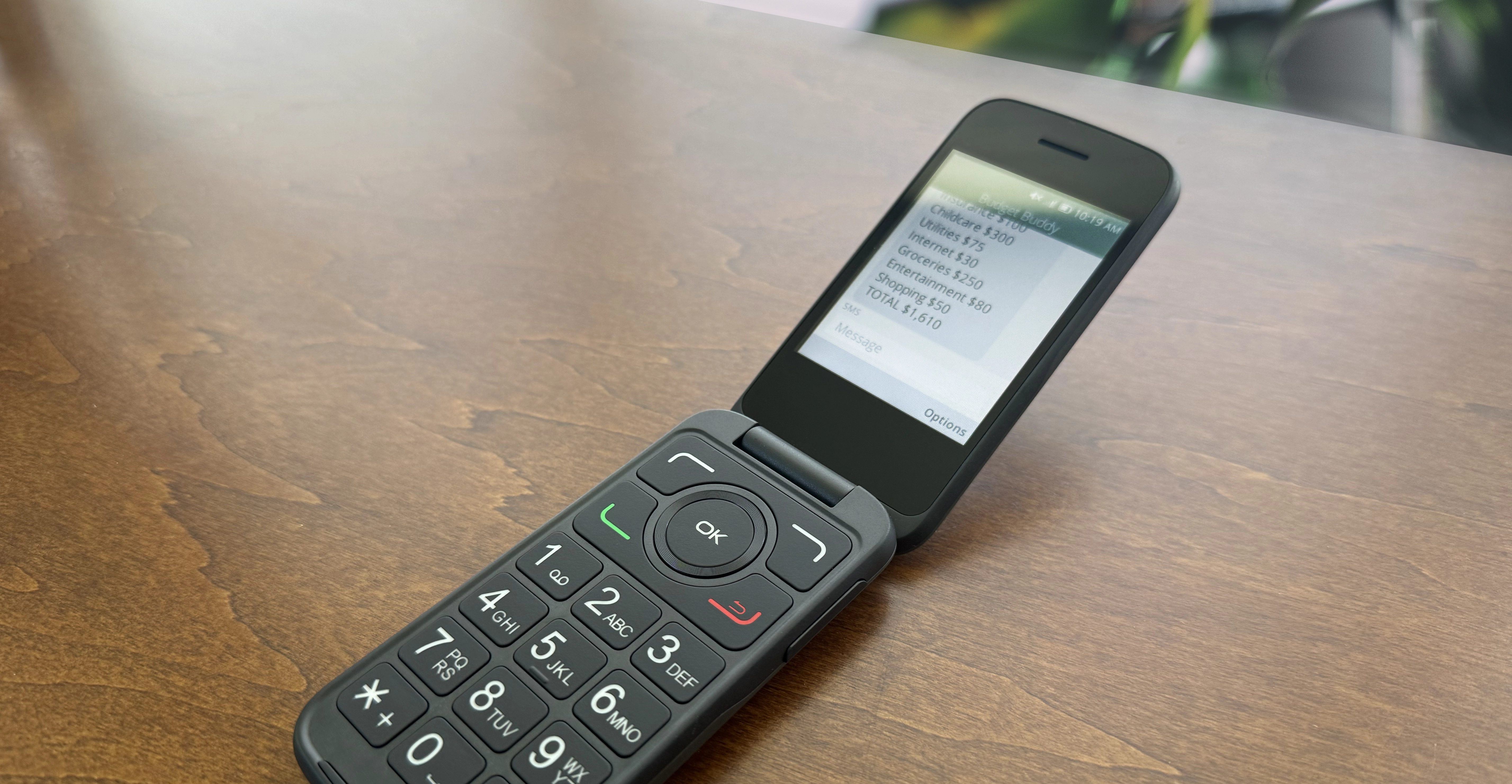
Black flip phone on wood surface showing a budget message with expense categories and total.

The Problem

80.5% of single-parent households in the US are headed by women. 31% live below the poverty line.

Despite having the most to gain from a personal budget, this group is the least served by the $1.5B personal finance app market. The market is built around assumptions of smartphone access, baseline financial literacy, and discretionary time to learn new software.

The budgeting space is saturated, but saturation isn't the same as solved. Every major app shares the same design premise: the user already knows what a budget is, already owns a capable device, and just needs a better interface. For single parents living paycheck to paycheck, none of those premises hold.

What was missing wasn't a better budgeting app.
It was a service that met users where they actually were.

The Hypotheses

1. Users lack financial literacy — the solution is education and guidance.
2. Users lack a system that fits their real lives
— the solution is removing friction, not adding content.

The distinction between the two mattered because it would determine whether I was building a teaching tool or a service tool. These require fundamentally different design approaches.

The Interviews

I conducted 6 semi-structured interviews with people who did not currently maintain a budget. I needed to understand the non-starters, not the converted.

Every participant understood what a budget was; not one cited lack of knowledge as the reason they hadn't started. Hypothesis 1 was wrong. What emerged instead were three interlocking themes.

Fear of failure
The belief that starting a budget and falling off it would feel worse than never starting.
The paycheck-to-paycheck trap
A sense that budgeting was a tool for people with money to spare, not people already stretched.
Accountability without judgement
Wanting something that would hold them to their goals without shaming them when they slipped.

These aren't usability problems, they're emotional and logistical ones.
The design response had to address both.

The Solution

The most important insight from research wasn't what users wanted from a budgeting tool, it was that the interface itself was the barrier. Apps require learning. They require opening. They require remembering. For users already stretched thin, that overhead was enough to kill adoption before it started.

The solution that checked every box wasn't a better app. It was no app at all.

Budget Buddy is a personal budgeting service delivered entirely over SMS. After a one-time web sign-up, Budget Buddy guides users through building their first budget, prompts them to categorize transactions, sends check-ins, and celebrates milestones — all through standard text messages, on any phone.
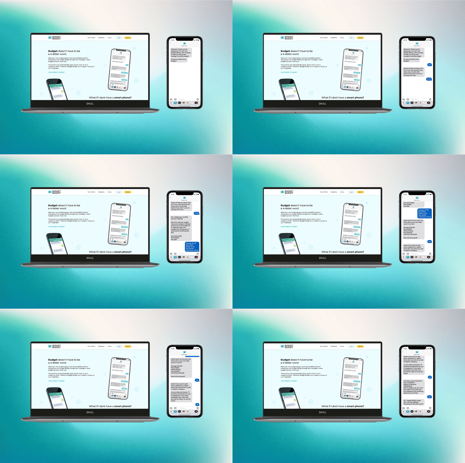
Laptop and smartphone showing Budget Buddy budgeting app with text conversation on screen

Why SMS specifically

Works on any mobile phone, including non-smartphones — critical for a demographic where 31% live below the poverty line.

Meets users in an interface they already use dozens of times per day.

Eliminates the complex UI that 60% of interviewed users cited as a past barrier to budgeting apps.

Conversation Design

Giving Budget Buddy a voice

Without the right personality, the service wouldn't work. Financial conversations carry real emotional weight, especially for users who've experienced financial stress or failure. The personality had to be warm without being patronizing, expert without being intimidating, and consistent enough to feel trustworthy over weeks of interaction.

Casual, not formal
Contractions, plain language, no financial jargon.
Expert, not lecturing
Confident guidance without explaining things users didn't ask about.
Warm and calm
Especially in error states — never making users feel stupid for a wrong input.
Honest about limitations
If Budget Buddy can't do something, it says so directly rather than looping.

Designing for conversation repair

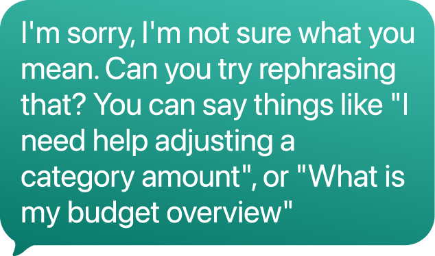
One of the core challenges in SMS-based interfaces is that conversation can break in ways a graphical UI never encounters. A user can type anything. They can ignore a prompt. They can respond hours later. The system has to be resilient to all of it.

I mapped repair patterns — the mechanisms Budget Buddy uses when a conversation goes off the expected path — as a first-class design deliverable alongside the happy path flows. These included:
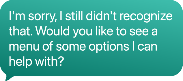
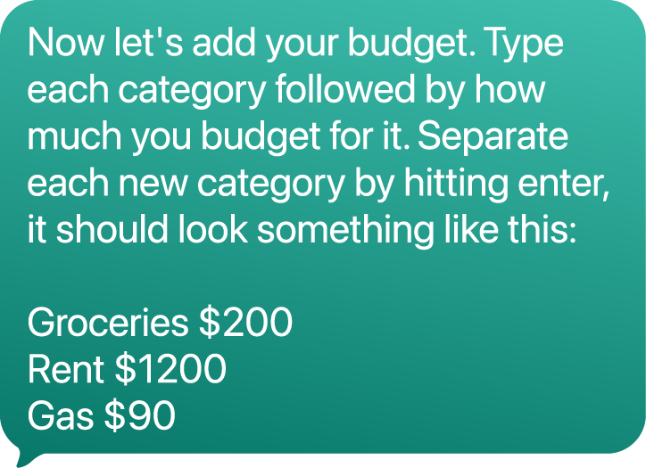
Clarification prompts
when a response couldn't be parsed.
Format hints
inline with prompts (e.g. "Type the amount, like: 450") to prevent the most common input errors before they happened.
An explicit escape hatch
("Type HELP at any time") so users never felt trapped in a flow they couldn't recover from.
Teal speech bubble text saying: I'm sorry, I still didn't recognize that. Would you like to see options?
Text bubble instructing to add budget categories and amounts, with example: Groceries $200, Rent $1200, Gas $90.
Chat bubble with message asking to rephrase and giving examples for budget help.

Testing

Wizard of Oz

I used Wizard of Oz testing to simulate the live service. Participants were instructed to "think out loud" as they signed up for and interacted with what they believed was an automated system while I manually populated each "system" response in real time based on the conversation design flows.

Participants
6 total; 4 matched the target demographic (single parents who do not currently budget).

This method gave me direct observational data on how users interpreted Budget Buddy's prompts — not just what they said, but what they thought, where they paused, hesitated, or typed a response and then deleted it.

Person typing on a laptop with a chat app and video call screen visible on a wooden table.

Primary findings

Prompt ambiguity was problematic
When Budget Buddy asked for input without showing an example format, participants hesitated, unsure whether a wrong answer would trap them. Adding inline format hints to every free-text prompt reduced hesitation incidents from multiple per session to zero.
The mental load needed reducing
Participants struggled to recall budget categories they'd set earlier in the conversation. An on-demand recap command resolved this without lengthening individual messages.

Results

SUS Score
95.625
CSAT
100%
WTP (unprompted)
3 of 6 test participants

What I would do next

Proactive nudges
when no transactions have been logged mid-month.
A lighter onboarding path
for users who want to start with one category instead of building a full budget upfront.
Accessibility testing
with users across varied levels of digital literacy — the SMS format should help, but accepted vocabulary needs real-world stress-testing.

Lessons learned

Screener criteria matters as much as interview questions.
The most valuable interviews were with people who had never budgeted, not people who'd tried and stopped. Non-budgeters came in without entrenched mental models and were far more open to a fundamentally different format.
Wizard of Oz testing is a two-person gig.
Running the session solo split my attention between moderating and operating the back end. In future rounds, I would separate these roles. The pauses were audible in recordings, and a dedicated operator would have freed me to probe more deeply in the moment.
The biggest lesson: it's important to think outside the box.
Recognizing that the interface itself was the problem and having the confidence to remove it entirely was the pivotal moment for this product. In a time when the solution always seems to be another app, this idea could have easily been missed.

Other work

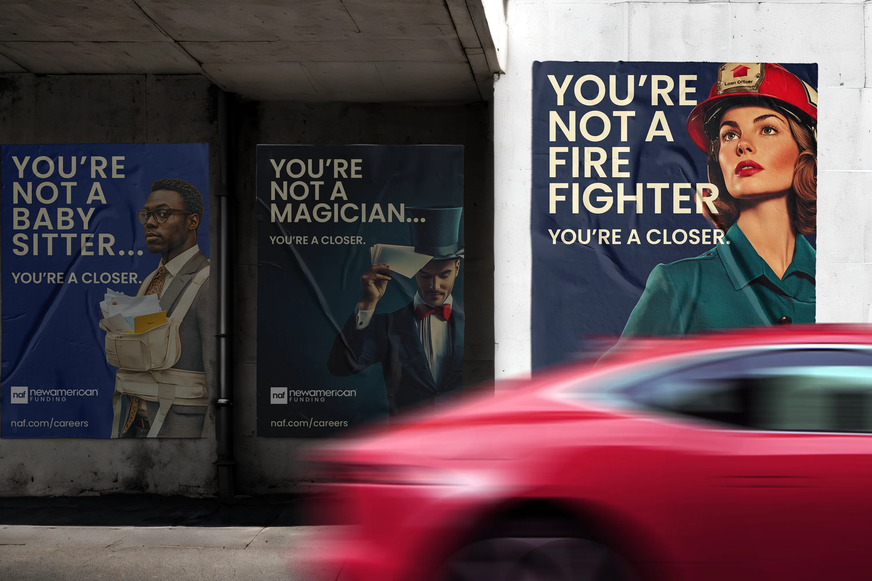
Three posters say you're not a babysitter, magician, or firefighter; you're a closer, showing diverse professionals.
Case Study

NAF

National recruitment campaign with 677% increase in candidate acquisition over 4 months.
View Case Study
View Case Study
Blue background pattern with various outlined symbols including hearts, stars, rainbows, keys, and peace signs.
Case Study

NAF Pride

Foster a workplace culture where LGBTQ+ employees can bring their full selves to work.
View Case Study
View Case Study