Case Study
NAF
National recruitment campaign with 677% increase in candidate acquisition over 4 months.
Role
Focus
Tools
Team
Shauday Smith, Design Director
Kevin Thomson, Creative Director
Whitney Rayner, Copywriter
Too long; didn't read
Highest month in company history.
The Client
New American Funding (NAF) is one of the nation's largest independently owned mortgage lenders, with a retail division spanning hundreds of branches and thousands of Loan Officers (LOs) nationwide.
The retail division's competitive advantage is operational. NAF removes the friction that slows LOs down; faster underwriting, stronger support infrastructure, fewer administrative obstacles between an LO and a closed loan. The problem was that this advantage was invisible.
Executive leadership set a clear priority:
dramatically accelerate retail Loan Officer acquisition.
The Brief
Loan Officers are among the most aggressively recruited professionals in financial services. Every pitch sounds the same: better technology, better culture, better support, better splits. Previous recruiting efforts from NAF followed suit; they weren't telling the story in a compelling way.
NAF's retail proposition is real and specific: LOs who join NAF close more because NAF gets out of their way. The campaign needed to communicate that truth in a way that felt completely different from everything else in their inbox and make them feel it before they read a single word of copy.

Creative Direction
Standing out wasn't just a visual goal, it was a strategic one. An LO who stops to look at something is already having a different experience with NAF than they've had with anyone else. The creative direction had to earn that pause.
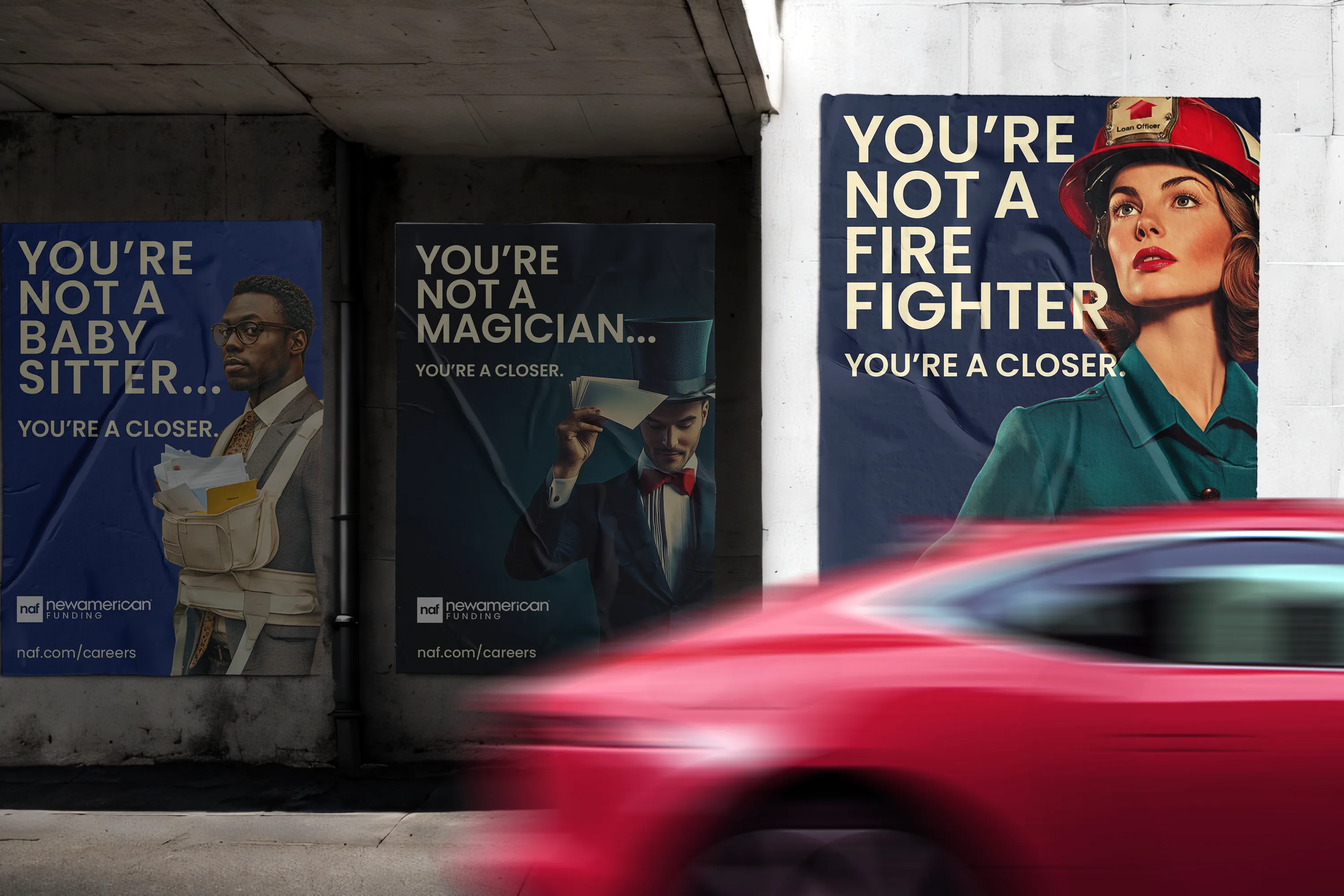
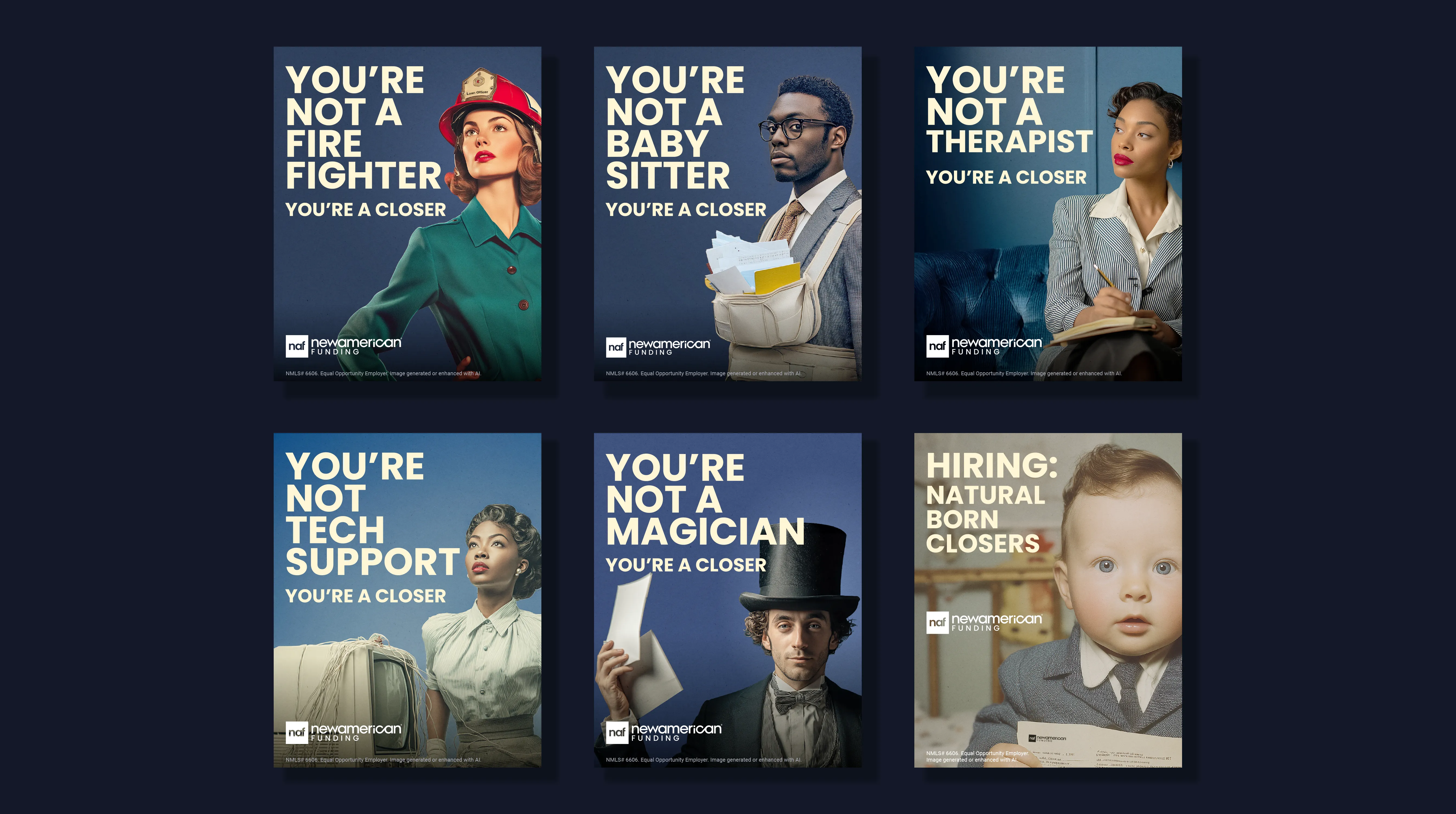
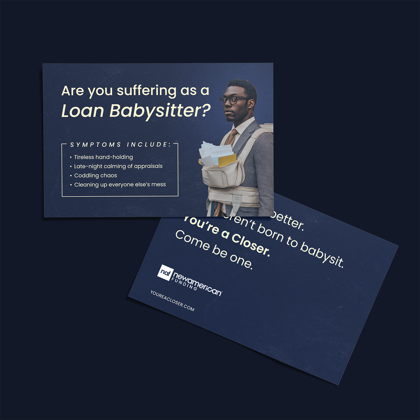
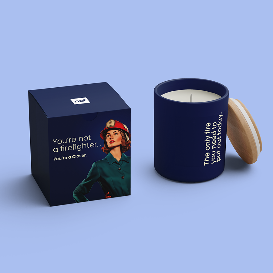
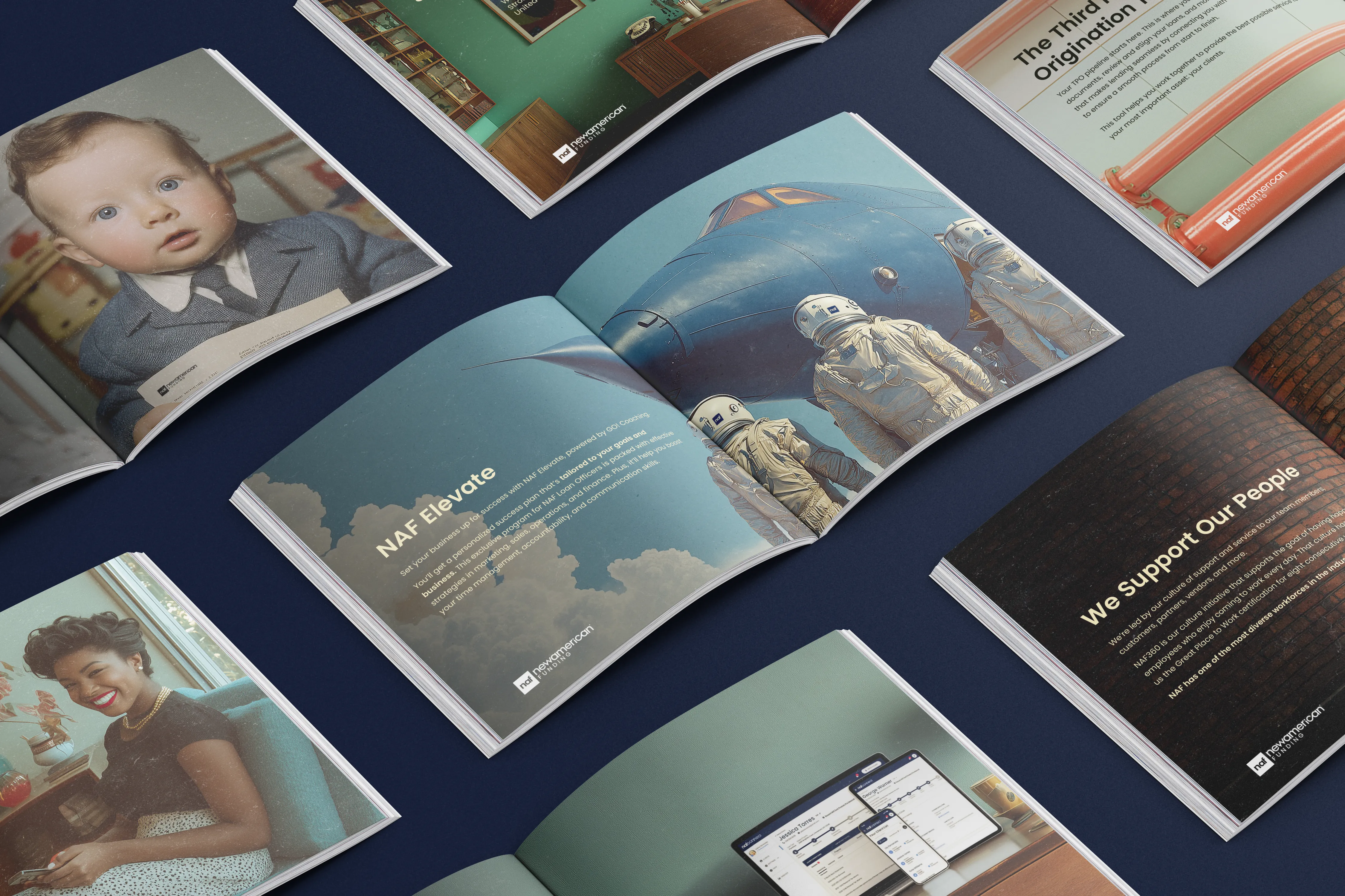
The team explored three directions, each with unique messaging: Brutalism, Bauhaus, and Retro-futurism. Each style fulfilled the design brief in its own way, but ultimately, the Brutalistic and Bauhaus campaign concepts felt too safe; they could have been recruiting for any corporation across any industry. The Retro-futurism concept was edgy and immediately captured attention with it's nostalgic, idealistic imagery and punchy headlines.
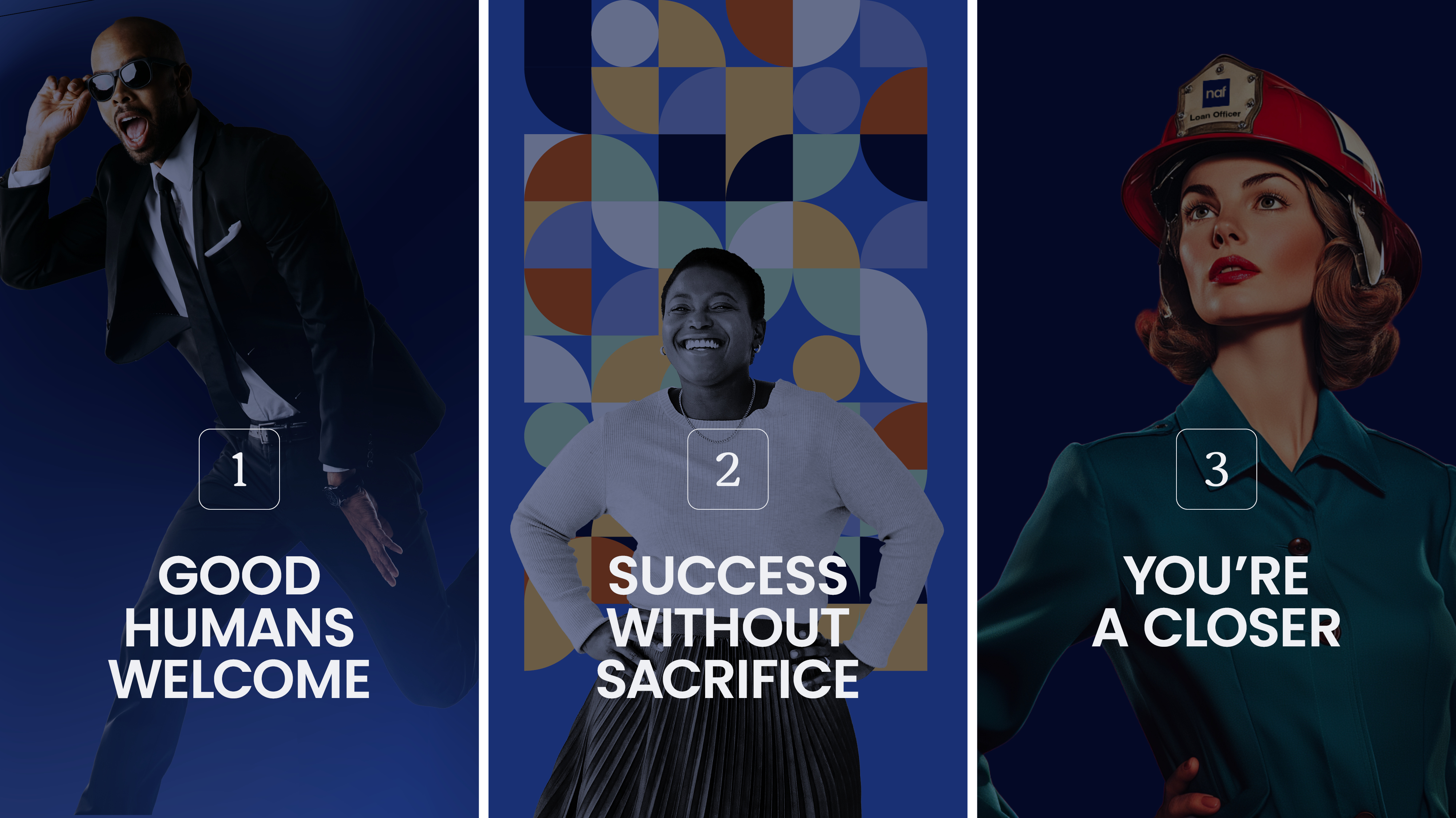
Retro-futurism gave the campaign a genuine point of view. The aesthetic draws on mid-century optimism and translates it into a visual language that feels simultaneously nostalgic and forward-thinking. Inspired by 1950's print ads, the imagery is meant to evoke a sense of tradition which is subverted by the messaging.
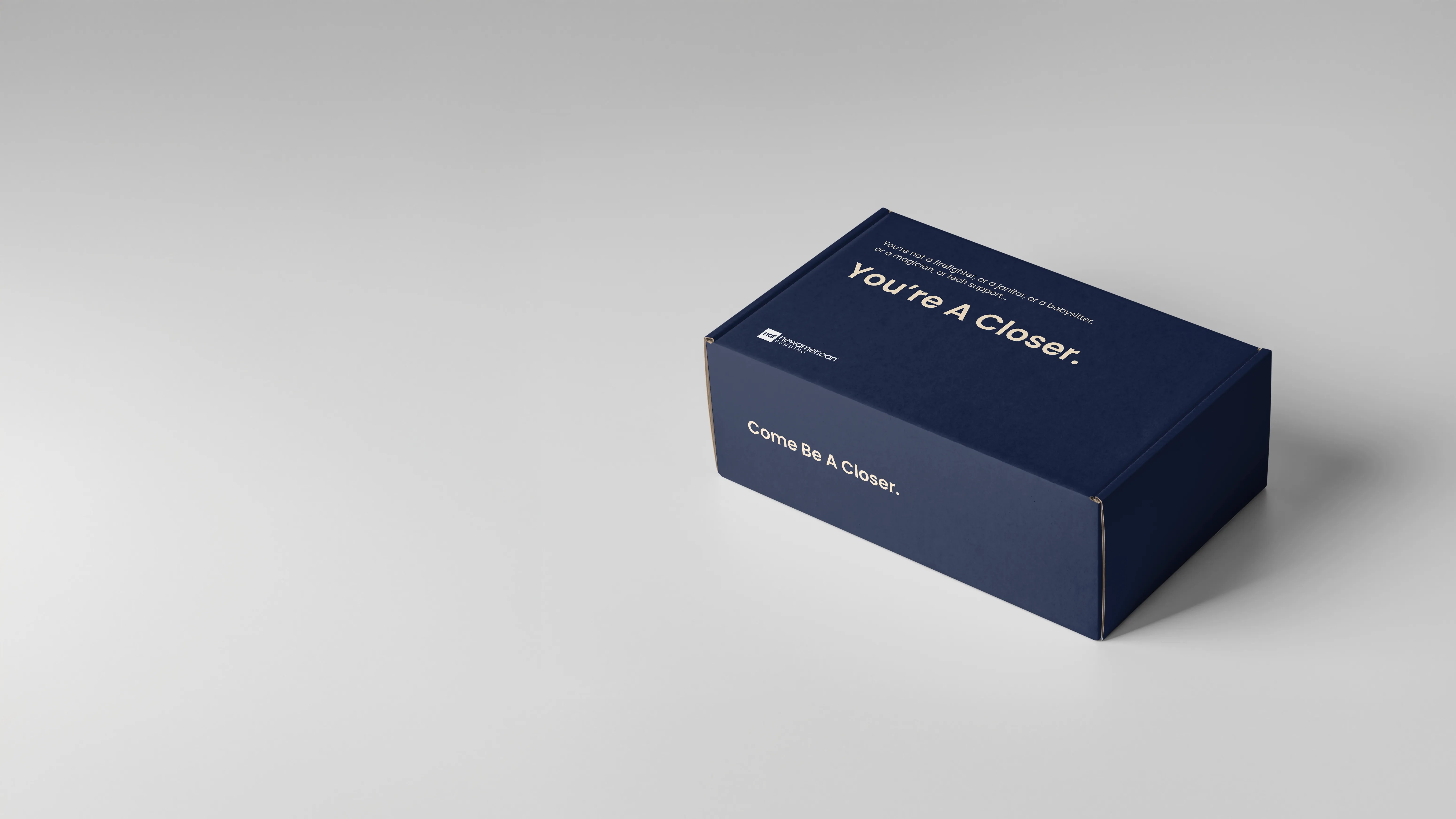
The core campaign message highlighted how many other jobs LOs were expected to do in their current positions. Putting out fires, babysitting loans, cleaning up administrative messes, being expected to work magic... the list goes on.
The message to LOs is clear; NAF doesn't want you to do all those other jobs, they want you to do what you're best at, closing loans.
The Work
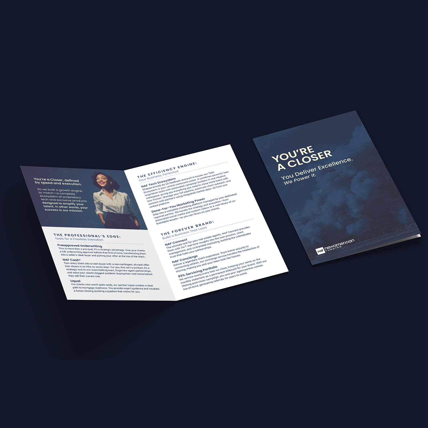
My Role
Design Lead, end-to-end
That meant owning the campaign concept from the first brief through final production across every channel. It also meant mastering the art of the prompt to get Midjourney to consistently generate high-quality imagery that matched the style and vibe of the campaign, without crossed-eyes and extra fingers.
At the scale and breadth of this campaign, keeping strategy and craft aligned across every deliverable, every scope change, and every stakeholder conversation was as much the job as the design itself.
Results
Highest month in company history.
677% increase in recruited Loan Officers, measured over 4 months (Dec. 2025 - Mar. 2026) against the prior year, culminating with the highest month of retail loans closed in company history. These numbers speak volumes.
This exponential increase is evidence that the creative system worked consistently across enough touchpoints to change the outcome of a process that is deeply resistant to change. It gave the recruiting team something to stand behind; a brand that made their conversations easier because it had already done work before they walked in the door.
The result didn't come from the visual direction alone. It came from a company that had built something worth believing in, and a campaign that finally looked like it.