Case Study
Post Up
Helping remote workers locate public spaces to set up and work.
Role
Focus
Tools
Too long; didn't read
The Problem
Remote workers are a permanent fixture of the modern economy — and they're working from everywhere except their own offices. Coffee shops, libraries, hotel lobbies, coworking day passes, parks with decent WiFi. The problem isn't finding a space. It's finding the right space.
The current workflow for finding a remote-friendly location is fragmented and time-consuming: Google Maps for location, Yelp for reviews, the venue's website for hours, a separate search for WiFi quality, noise level, and outlet availability.
A worker can spend twenty minutes researching a location
only to arrive and discover the WiFi requires a purchase or the space is full by 9am.
The Goal
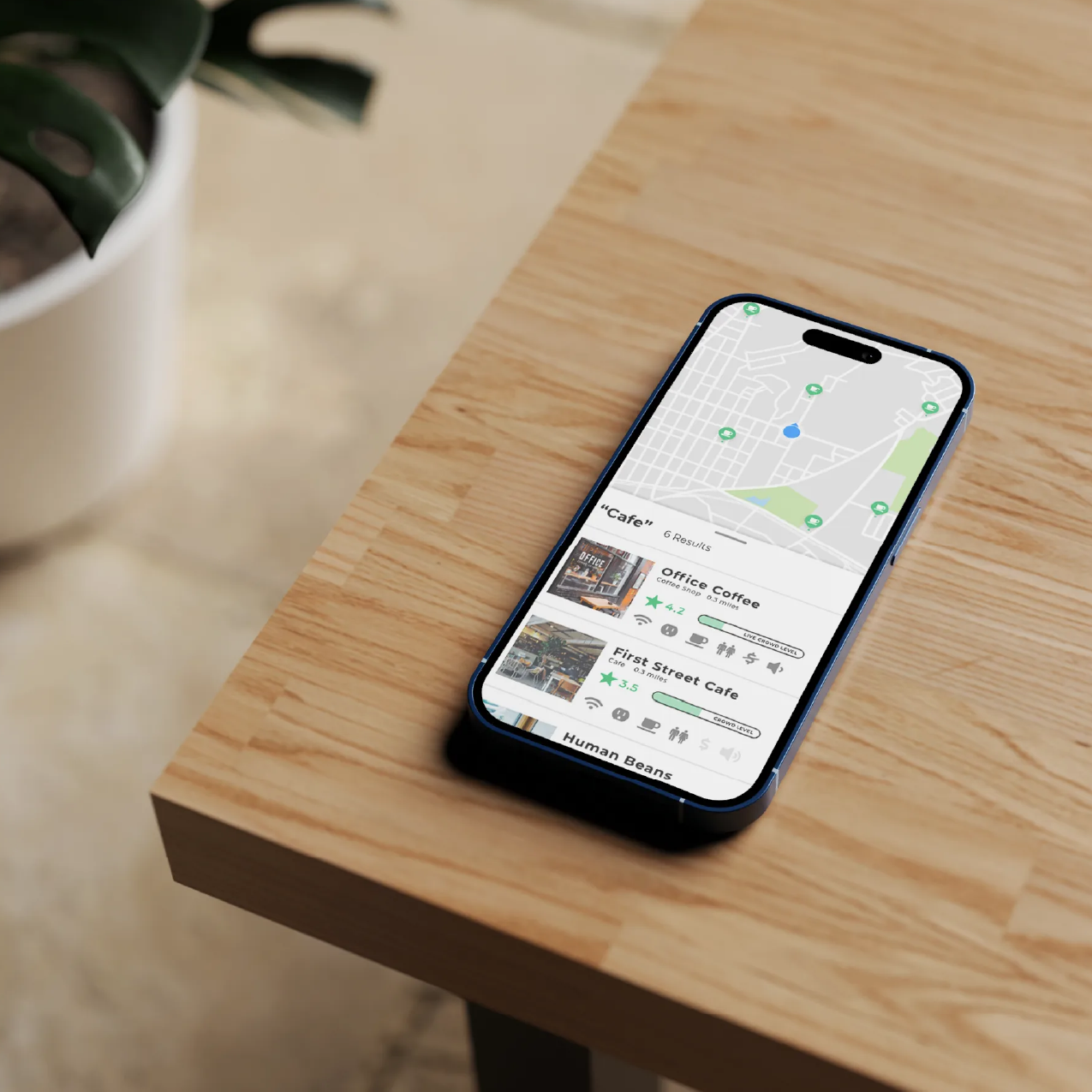
Build a mobile app that consolidates everything a remote worker needs to evaluate a space into a single, scannable interface, so the decision from "I need somewhere to work" to "I'm walking in the door" takes 2 minutes, not 20.
The secondary goal: make it valuable enough that users would pay a monthly subscription. That bar shaped every feature decision.
Understanding the users
I was provided with pre-existing user research: research highlights, a user interview, and a persona. Rather than treating these as a brief to execute against, I used them as a starting point for my own synthesis — identifying the underlying behaviors and mental models that the surface-level pain points pointed toward.
Three patterns emerged as the foundation for every design decision:
.jpg)
Competitive analysis
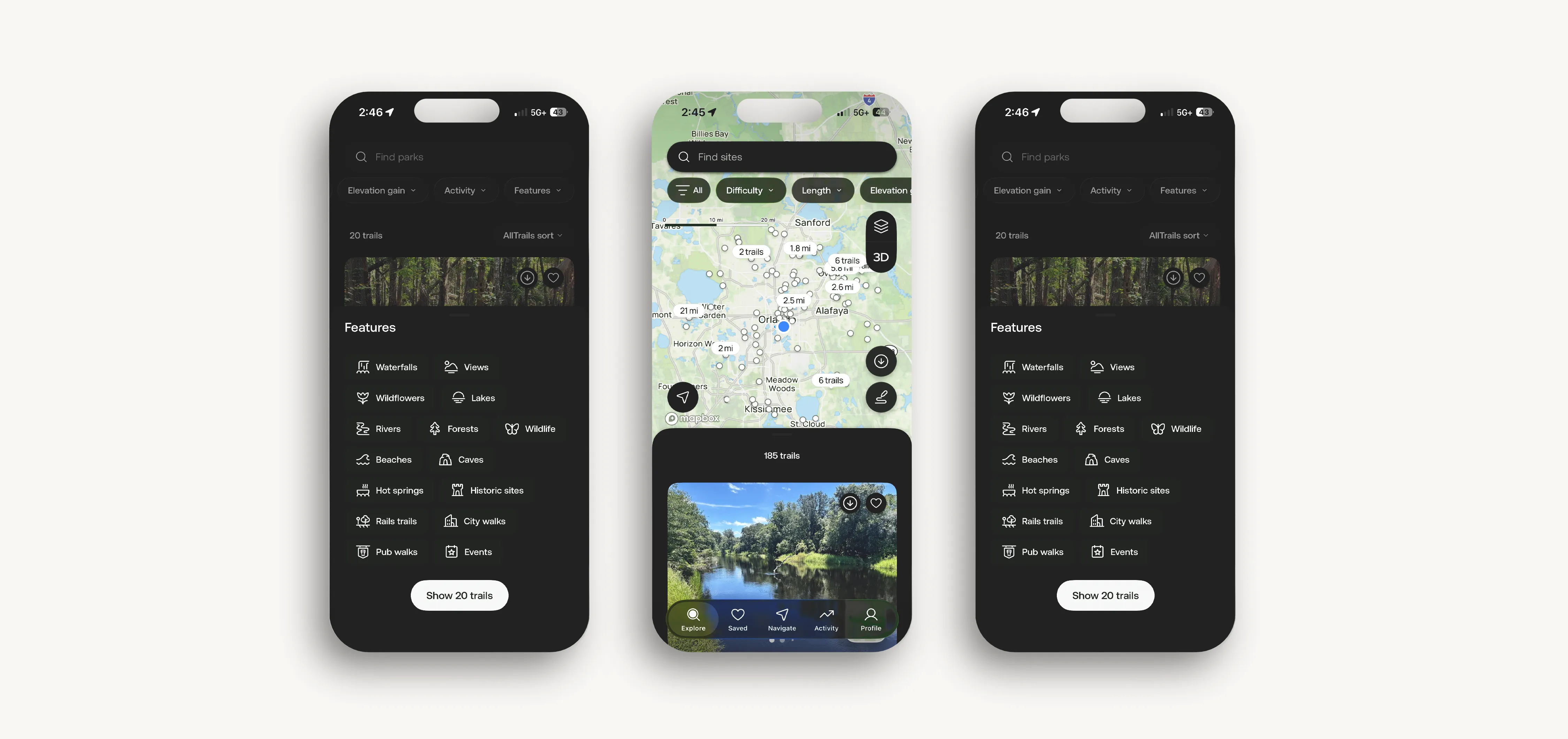
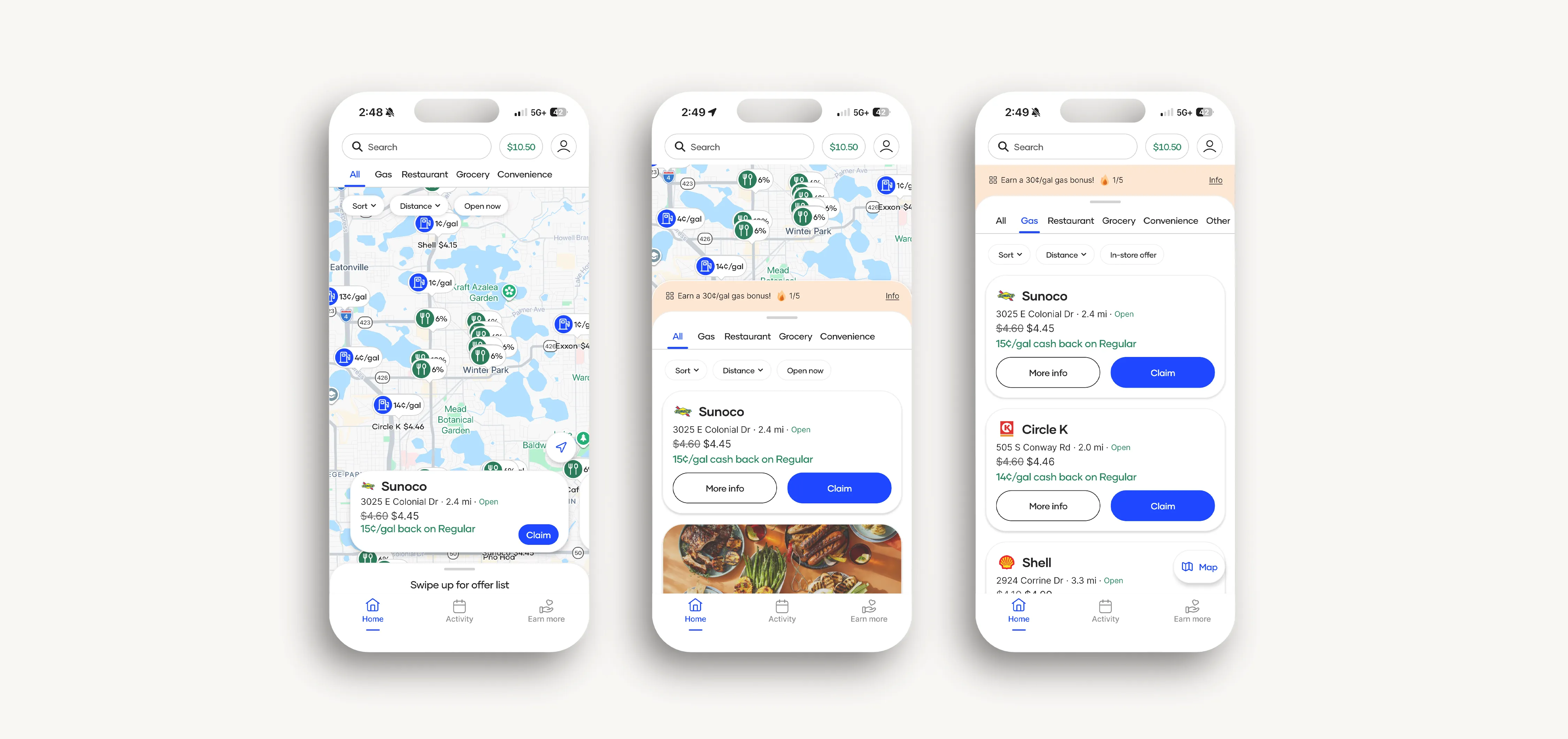
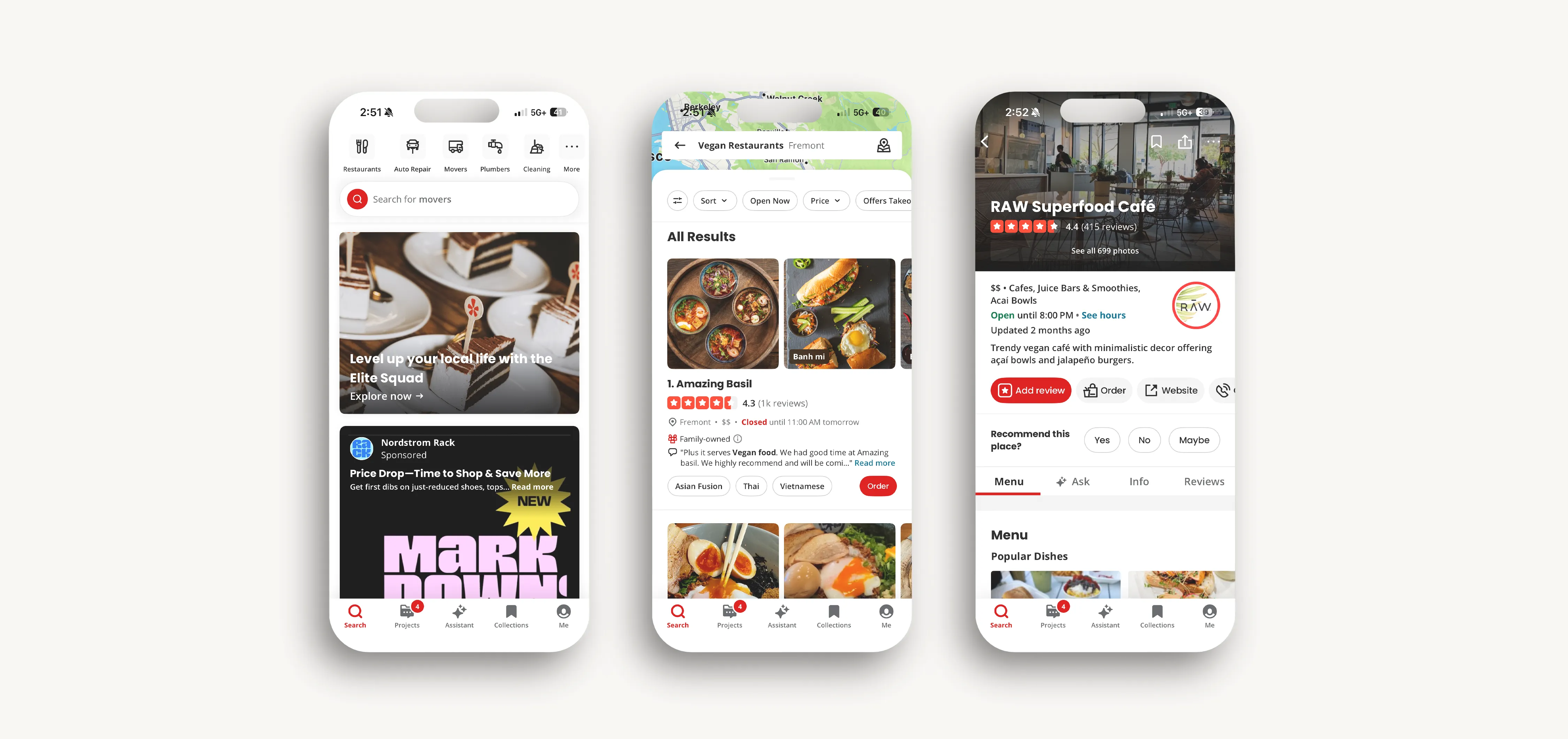
I used a lightning demo to study three apps that solve adjacent discovery problems: AllTrails (finding hiking trails), Upside (finding gas deals), and Yelp (finding restaurants). The goal wasn't visual inspiration, it was understanding what each app's design decisions teach about discovery UX, and what gap they collectively leave.
What All Trails gets right
Highly specific, filterable search built around the attributes that actually matter to the user; trail length, elevation gain, difficulty, surface type. The filter system is the product. Users come for the specificity that Google Maps can't provide. Post Up needed the same filter-first logic applied to workspace attributes.
What Upside gets right
Extremely low-friction entry. The default state is a map with immediate, scannable results. No search required to start seeing value. The passive discovery model is something Post Up could borrow for users who don't have a specific destination in mind.
What Yelp gets right
Social proof at scale. Review volume, photo quality, and recency signals do the work of building trust before a user commits to visiting.
Exploration
Crazy 8s
I focused the Crazy 8s exploration on highest-stakes screen in the experience, the results screen. The search itself is straightforward; the pain is in evaluating results. Eight rough directions in eight minutes, then a structured vote.
Direction 4 won: a card-based results list that prioritizes scannability over exhaustive information. Each card shows the venue name, a crowd meter, distance from the user, an amenity icon strip, and an overall rating. The decision to use icons rather than text for amenities was deliberate. A row of icons can be read in under a second, a list of words takes three times as long.
Sketching and storyboarding
With the results card direction chosen, I sketched the full primary flow: app launch to arrival at a chosen location. Three screens anchored the experience.
The storyboard extended the design beyond the app screens to validate the full use case: user realizes they need a workspace → searches Post Up → evaluates two or three options → reads reviews → gets directions → arrives. Each step mapped to a screen or interaction. The storyboard made one thing immediately clear: the review and photo content would determine whether users trusted the app enough to act on it. The UI could be perfect and the app could still fail if the content wasn't credible.One of the core challenges in SMS-based interfaces is that conversation can break in ways a graphical UI never encounters. A user can type anything. They can ignore a prompt. They can respond hours later. The system has to be resilient to all of it.
Prototyping
I built the prototype with realistic content throughout — real venue names, real photos, real amenity combinations — rather than placeholder text and generic images. The rationale: usability testing with placeholder content would measure how users navigate a prototype. Testing with real content would measure whether users trusted the product enough to use it.
Visual direction stayed close to the existing Post Up brand: clean, modern, high contrast, minimal decorative elements. The information was designed to do the work, not the aesthetic.
Usability testing
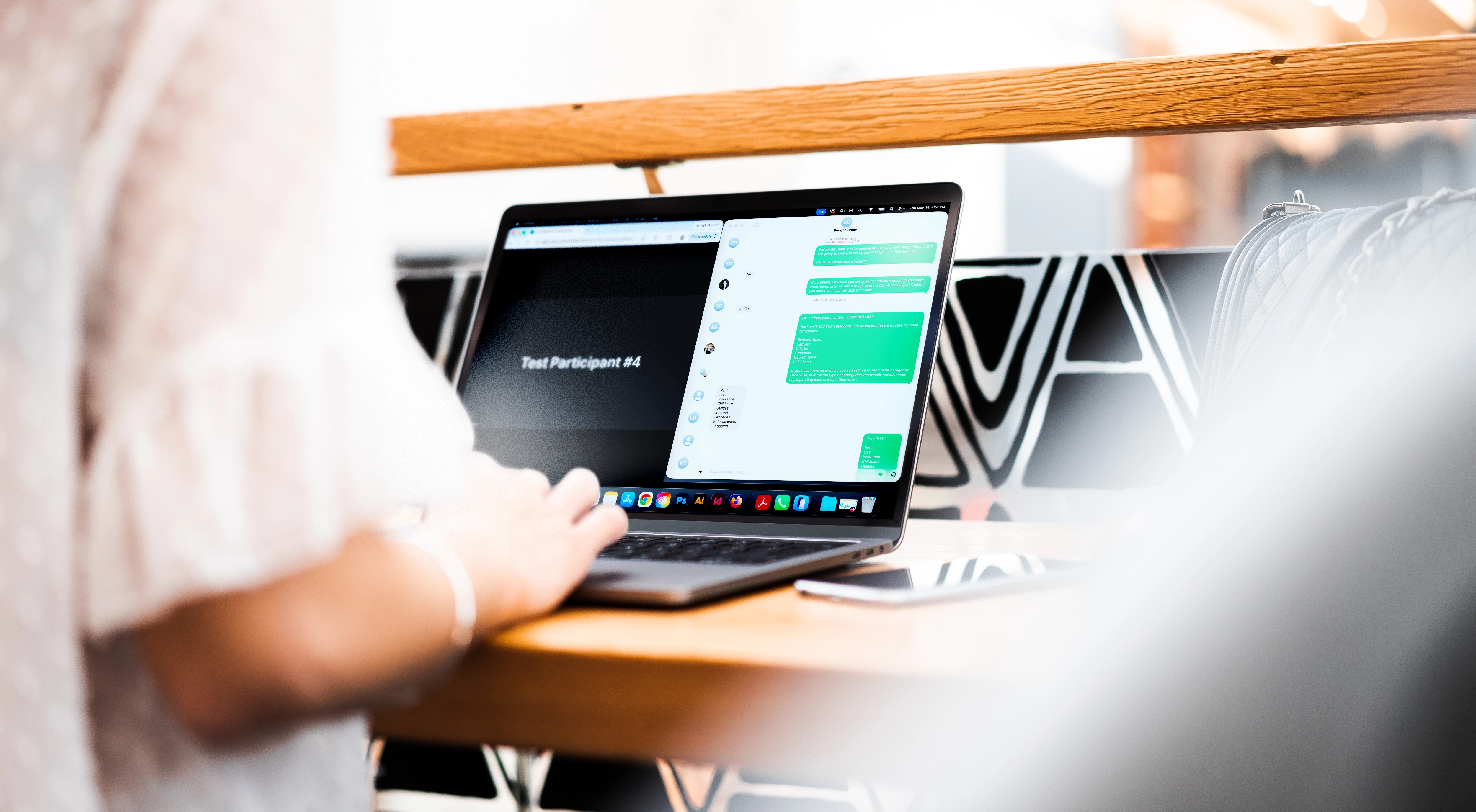
Five participants. Moderated sessions. Each participant was given two tasks: find a workspace within a specific distance that meets a defined set of amenity requirements, then find a workspace in an unfamiliar neighborhood with no prior criteria.
Four issues emerged clearly enough to be considered critical.
What testing revealed
The usability issues were solvable. The content credibility problem and the value gap were the more important findings — and they pointed toward the same root cause.
Post Up, as designed, helps users find information that exists elsewhere. It aggregates and consolidates. That's genuinely useful, but it's not yet a product users will pay for, because the value proposition — "we found this so you don't have to" — doesn't hold if users can find it themselves with two extra taps.
The version of Post Up that closes the value gap is one that generates insights users can't get anywhere else. Real-time occupancy data integrated directly from venue systems. Crowdsourced, remote-worker-specific reviews. Predictive busy-time modeling by day of week and time of day.
That's not a design failure. It's a product scope question that the UX work surfaced. The prototype did its job: it revealed the most important question the MVP hadn't yet answered.